The adoption of the CSS3 media queries specification by most major browsers has been a great thing for the web. More designers are paying attention to mobile design than ever before, and not only that: they're figuring out how to make the most of large screens while still catering to smaller resolutions, freeing themselves from the constraints of 960 pixel design.
Before you embark on your own media query experiments, check out these 41 inspirational responsive web designs.
Personal
The majority of the very first sites that cropped up using media queries were the personal sites of designers experimenting with the new technology. Check out these sites for unique, individual takes on responsive design.
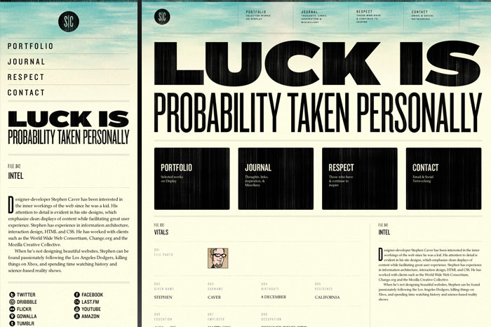
1. Stephen Caver
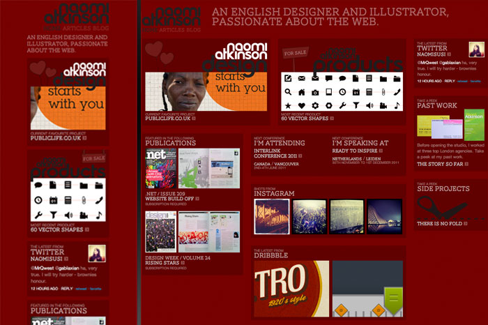
2. Naomi Atkinson
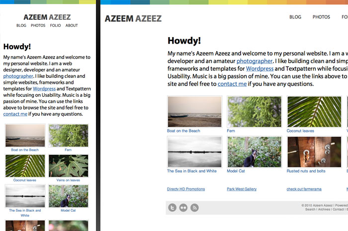
3. Azeem Azeez
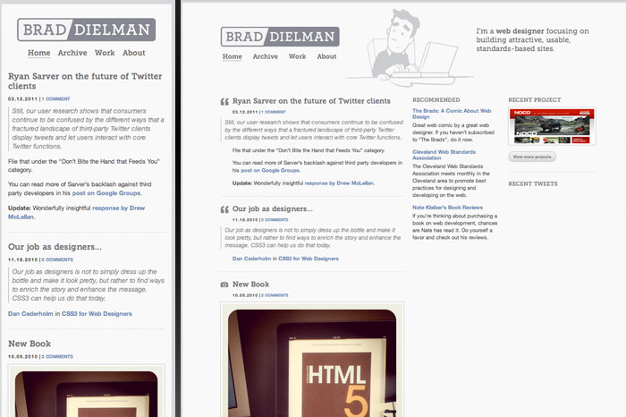
4. Brad Dielman
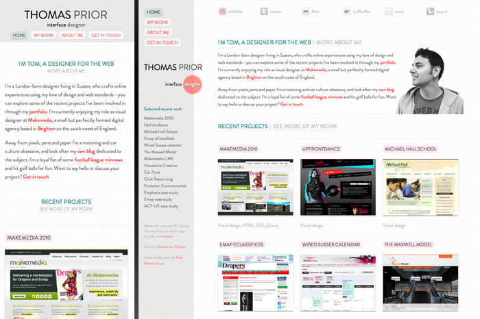
5. Thomas Prior
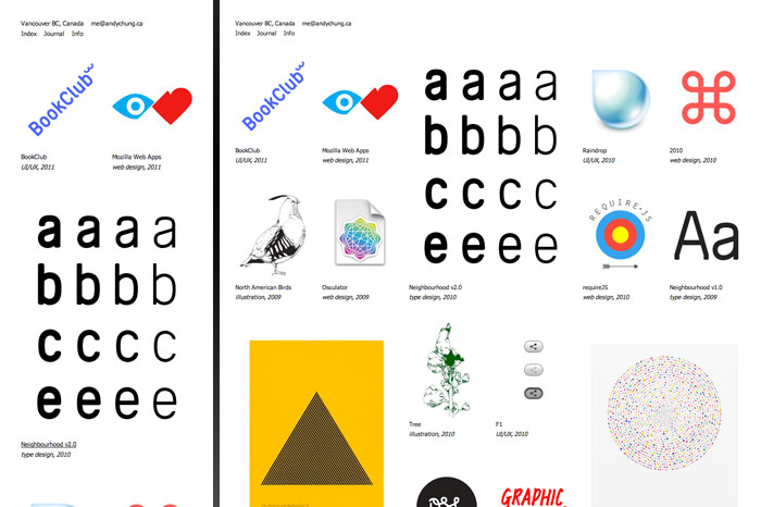
6. Andy Chung
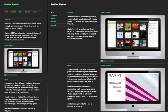
7. Bastian Allgeier
8. Zachary Miller

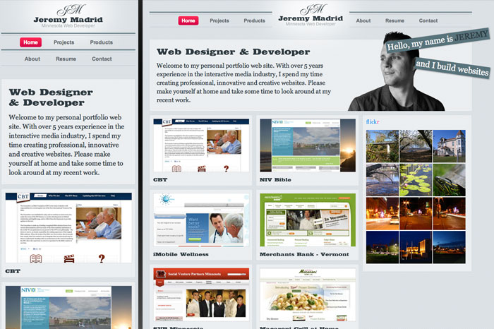
9. Jeremy Madrid
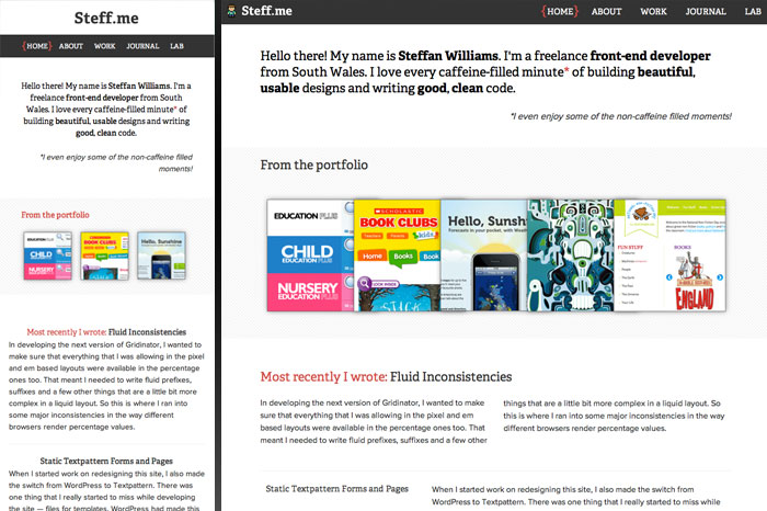
10. Steff.me
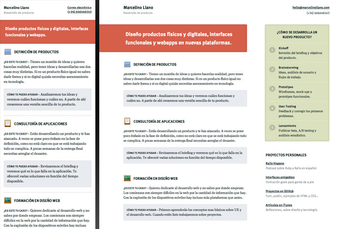
11. Marcelino Llano
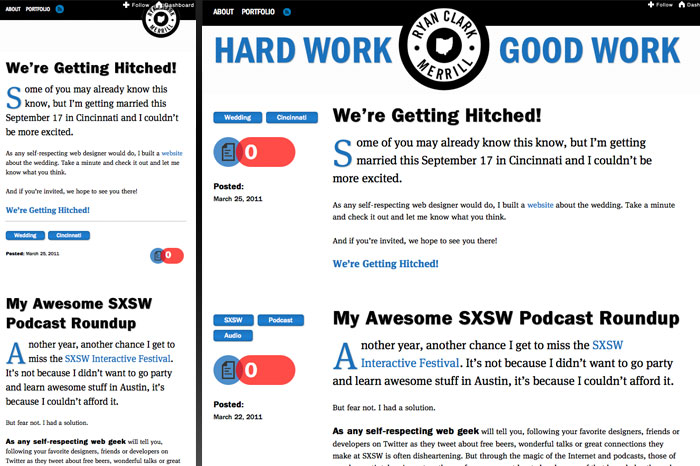
12. Ryan Merrill
Businesses & Events
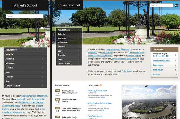
Since individual designers got comfortable with media queries, we've seen sites from design agencies and for design events start adopting responsive design techniques - and even a few more traditional businesses, such as - unexpectedly enough - St Paul's School.
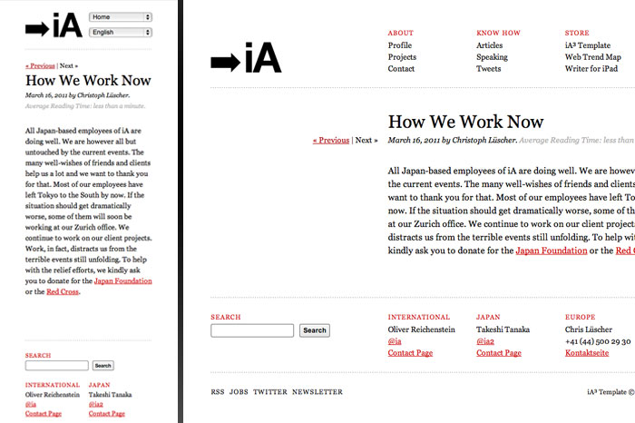
13. Information Architects
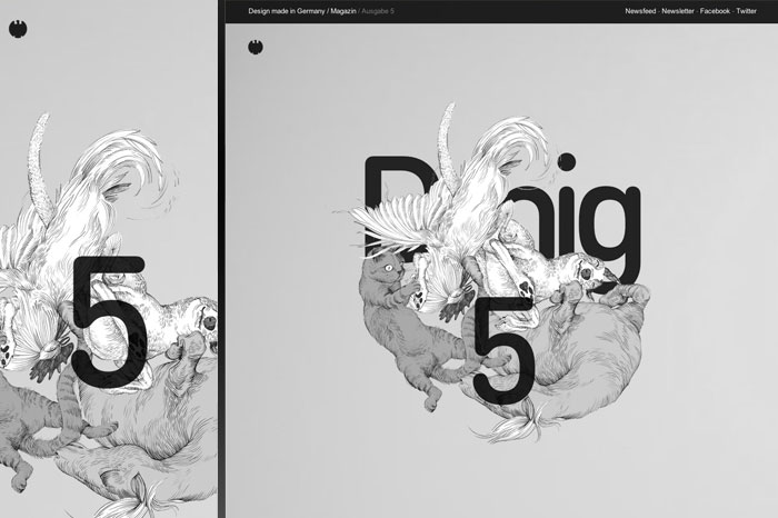
14. Design made in Germany
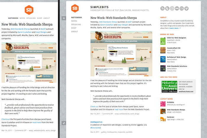
15. SimpleBits
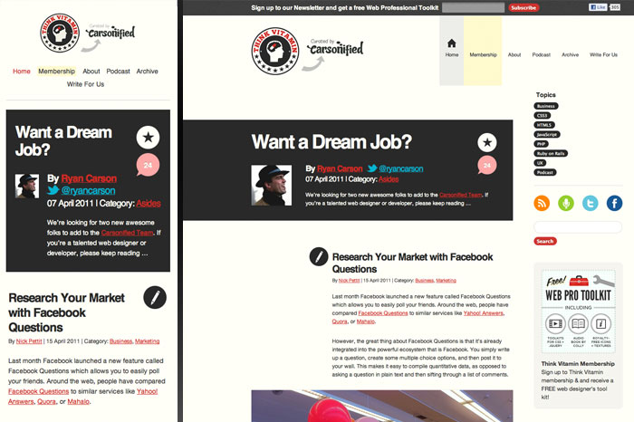
16. Think Vitamin
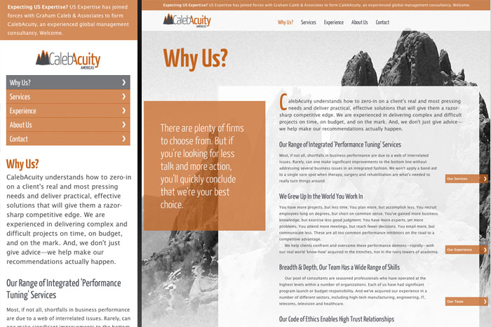
17. Caleb Acuity
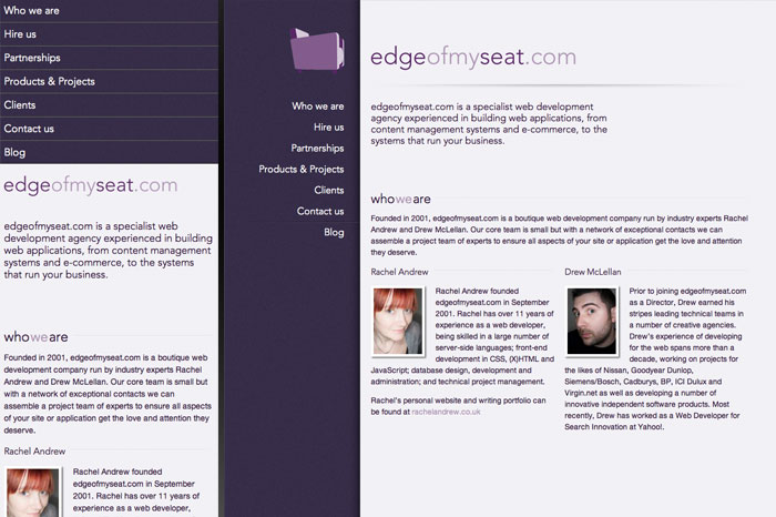
18. Edge of My Seat
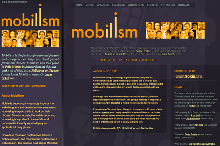
19. Mobilism
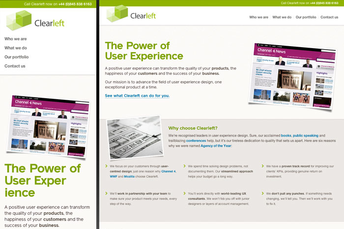
20. Clearleft
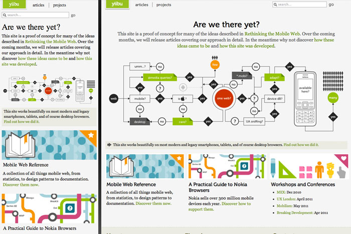
21. Yiibu
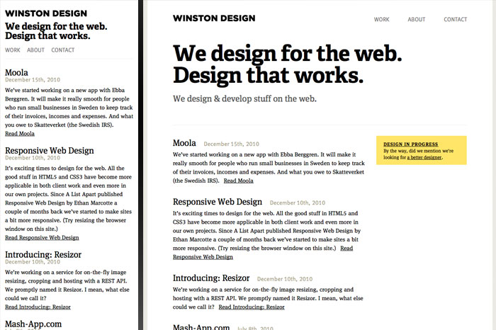
22. Winston Design
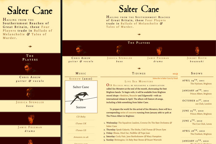
23. Salter Cane
24. St Paul's School
25. UX London

26. Sparkbox

Tools, Products & CSS3 Demos
One wouldn't expect it to take long before demo sites showing off the power of media queries and frameworks making them easier to work with started showing up. Check out these sites for more great responsive designs, and then take a look at some of these tools so you can get started with your own.
27. Less Framework

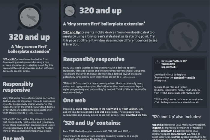
28. 320 and Up
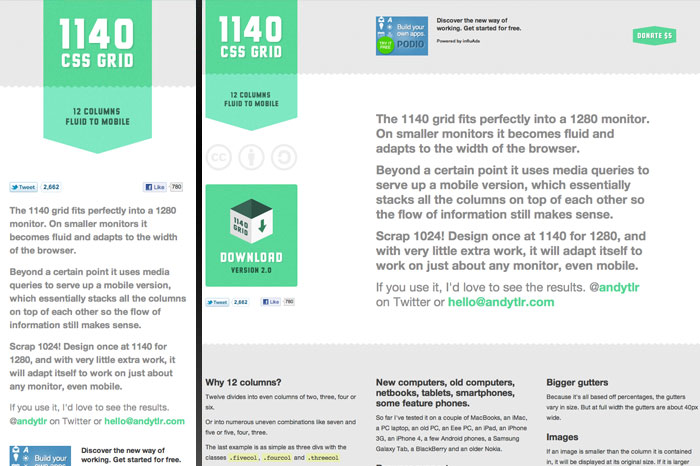
29. 1140 CSS Grid
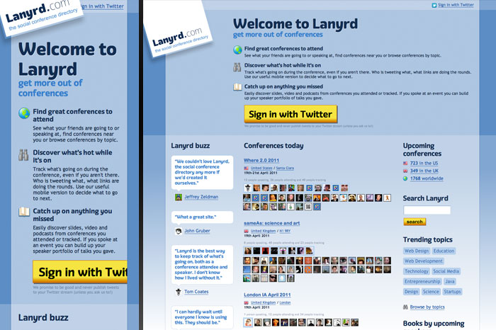
30. Lanyrd
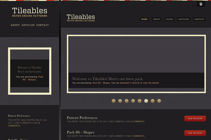
31. Tileables
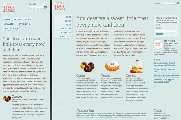
32. Little Pea Bakery
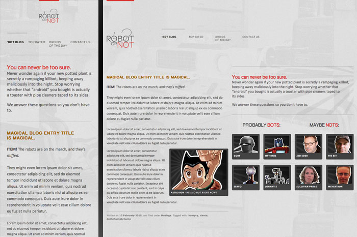
33. Robot or Not
Content Sites, Blogs & Magazines
Blogs and content-driven sites are perfect candidates for a responsive web design approach, and not just to make them better suited for mobile: when blog designs respond to the width of the window, visitors can choose the size and line length they're most comfortable with for extensive reading sessions.
34. CSS-Tricks

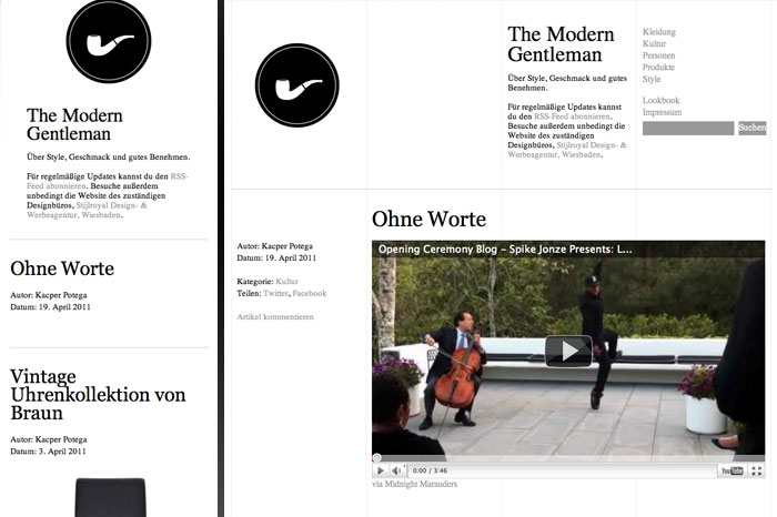
35. The Modern Gentleman
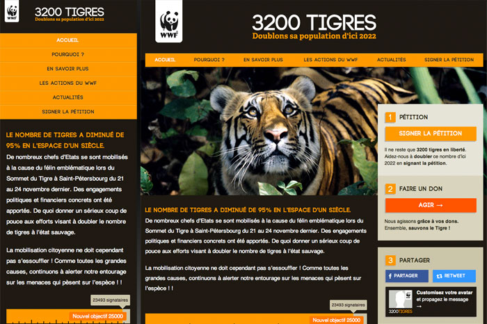
36. 3200 Tigres
37. About

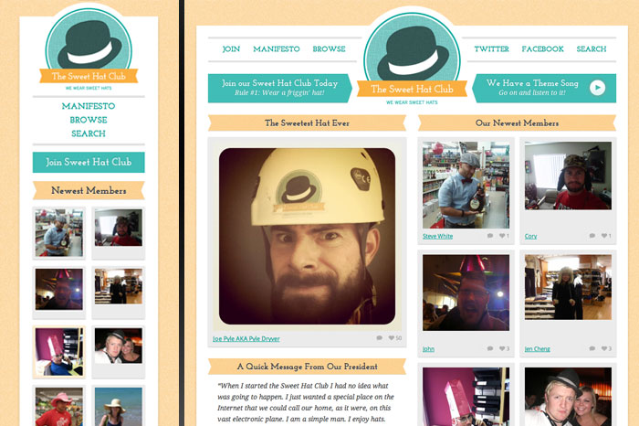
38. The Sweet Hat Club
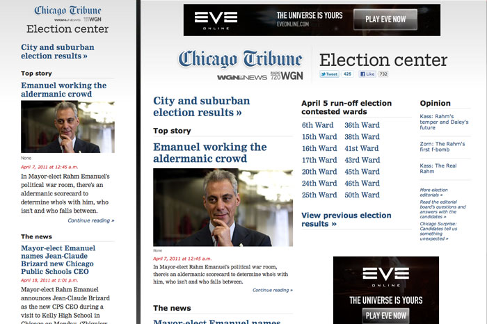
39. Chicago Tribune Election Center
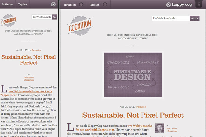
40. Cognition
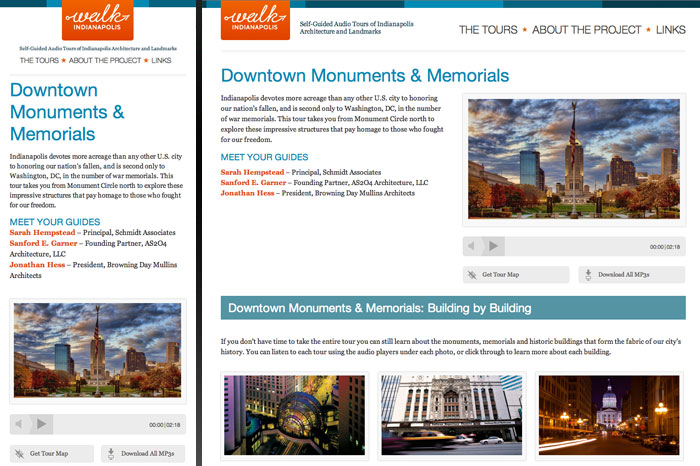
41. Walk Indianapolis
In conclusion
This is by no means a comprehensive list of the best responsive web designs out there. We've skipped over some that are so often showcased as champions of responsive web designs as you've probably already seen them, and there are doubtless many more new designs worthy of our attention.
Let us know about your own favorites in the comments or check out our responsive website logo maker!
Written by DesignCrowd on Monday, April 25, 2011
DesignCrowd is an online marketplace providing logo, website, print and graphic design services by providing access to freelance graphic designers and design studios around the world.
