Logo
redesigns are unavoidable as businesses naturally change and
design/marketing techniques improve over time. High profile logo
redesigns (good or bad) always garner publicity. However, bad
redesigns can get a lot more publicity than successful redesigns as A)
designers will jump on poor design and B) shareholders and the public
hate to see money wasted.
Below are the worst (and probably most expensive) logo redesigns in recent memory ...
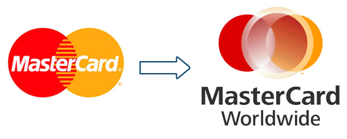
#1 Mastercard
Thankfully, MasterCard arent planning to put this
abomination on their actual cards.
#2 AOL
No - this is not a
joke. AOL change the logo on their website everyday. 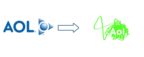
#3 Kraft
Kraft have changed their logo twice in recent times. Their old one is still a classic.
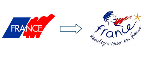
#4 France
France's new logo appears to include a starfish (something you might expect to see in Finding Nemo or
Australia but not in France or their logo).
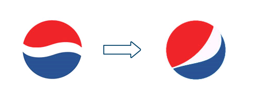
#5 Pepsi
Cost $1M and is apparently inspired by Decartes and Eintstein theory of relativity.
What could have been with
a logo contest ...
I wonder what the result would have been if each of these companies had run a logo contest? Imagine this, the Pepsi puts up a prize of
$100,000 to re-design its logo and opens it up to everyone around the world. They would receive thousands of
creative logos, save around $1M and get a better result. Ask a room of designers to think of a creative logo
for France, Kraft, AOL, Mastercard and their heads with burst with excitement and ideas.
Written by DesignCrowd on Friday, March 26, 2010
DesignCrowd is an online marketplace providing logo, website, print and graphic design services by providing access to freelance graphic designers and design studios around the world.
