Designing an eCommerce business website is way different than designing any other website. Why? Because the design can directly impact a visitor’s buying decision!
Store design needs to be welcoming, relaxed and create a space where people feel comfortable.
The design also needs to be on brand and appear professional to inspire trust. That includes the logo design and other brand elements. All combine to create an atmosphere where customers feel able to purchase with confidence.
In this blog post, we share the 17 best UI design tips for creating an eCommerce store that inspires and converts.
Use these tips in your next online store and see what a difference design can make!
1. Choose a Theme That Matches Your Brand
According to Stanford Web Credibility Research, 3 out of 4 people judge a website’s credibility based on its theme and layout.
It’s crucial to choose a theme that looks clean, professional, and attractive. But it doesn’t stop there.
Your theme should resonate with your brand’s colors, fonts, and overall style. A cohesive design helps establish brand recognition and builds trust with your customers.
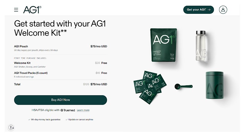
For instance, Athletic Greens, an online store that sells nutritional blends, chose a theme that reflects its brand identity - green and white.
White represents peace and minimalism, while green represents the organic nature of their nutritional blends.
2. Show Important Information Above the Fold
Place key information such as special offers, best-selling products, and calls to action (CTAs) above the fold.
This area is the first thing visitors see without scrolling, so make it count.
Amazon displays everything essential about the product right above the fold. You don’t even need to scroll to make a purchase decision.
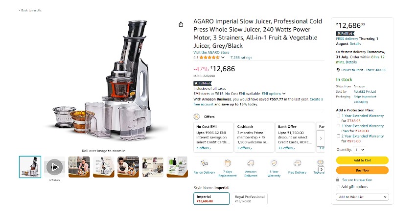
Why should you model your product page after Amazon’s?
- Product images to engage.
- Discount percentages to persuade.
- Variants can be selected with one click.
- The feature-backed title communicates crucial information.
- Colorful and optimally placed buttons encourage quick purchases.
You don’t have to copy the design as is, but we recommend using the same principles.
If it works for the largest retailer in the world, it can work for you!
3. Organize Menus for Easy Navigation
An intuitive, well-organized menu is essential for a positive user experience.
Categorize products logically and use clear labels. Dropdown menus can help manage extensive inventories.
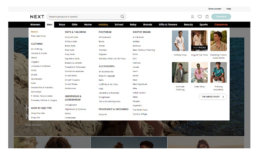
For example, Next, a popular clothing brand in the UK, organizes products in categories such as women, men, boys, girls and home with relevant sub-menus
This makes it easy for shoppers to navigate the website and quickly find what they are looking for.
4. Help Customers Navigate With Breadcrumbs
Breadcrumbs are a secondary navigation aid that shows users their location on your site. They enhance the user experience by making it easy to backtrack.
It’s a small design element but punches way above its weight.
For example, Body Bliss, a brand that sells bath and skincare products, has a breadcrumb trail that looks like Home > Product Categories > Bath and Shower > <product_name>.
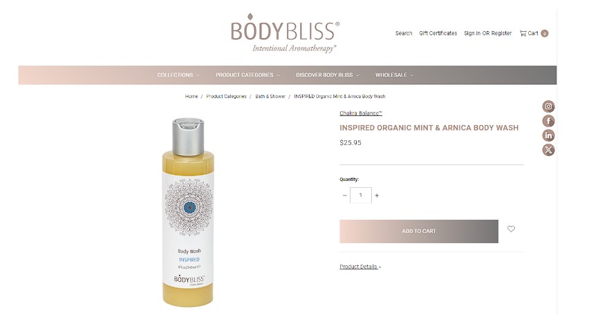
Breadcrumbs are not only helpful with navigation but also with SEO as they create additional internal links.
5. Show Authenticity With Customer Images
Using real customer photos instead of stock images adds authenticity to your site.
Encourage customers to share their photos with your products on social media and feature them on the page. This helps build trust and makes your brand more relatable.
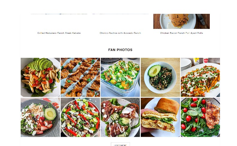
Tessemae sells salad dressings and marinades and asks customers to share pictures of their dishes using its products.
This not only gives you free user generated content, it also adds a touch of authenticity.
6. Add Social Proof on Product & Checkout Pages
According to TrustedSite, 40% of online shoppers decide not to buy from an eCommerce store if there are no trust indicators on the page.
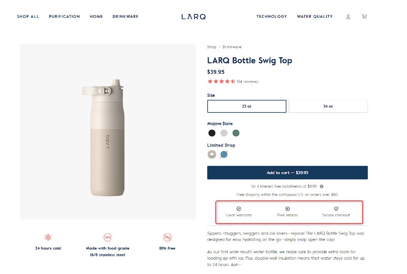
Most online stores add trust badges on their product pages, landing pages, and checkout pages to show that they are legitimate businesses.
For example, LARQ shows that their products come with a one-year warranty, free returns, and a secure checkout.
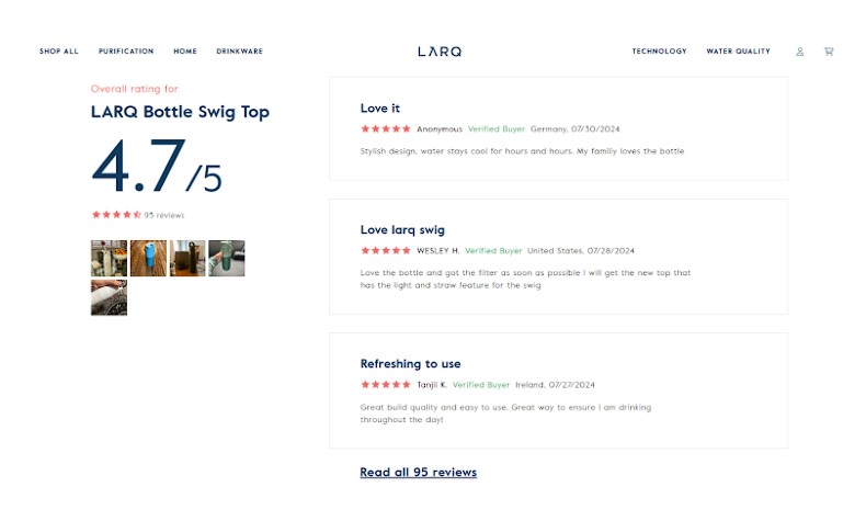
Along with trust seals and product-related information, showcasing customer reviews can significantly impact buying decisions.
Include these on product pages and during checkout to reassure potential buyers.
7. Display Discounted Prices to Create FOMO
Highlight discounts and limited-time offers to create a sense of urgency.
Showing the original price alongside the discounted price can create a fear of missing out (FOMO), prompting impulse purchases.
For example, CartFlows, one of the most popular WordPress sales funnel builders, shows discounted prices next to its original prices. This persuades the buyer to think that they are making a huge saving.
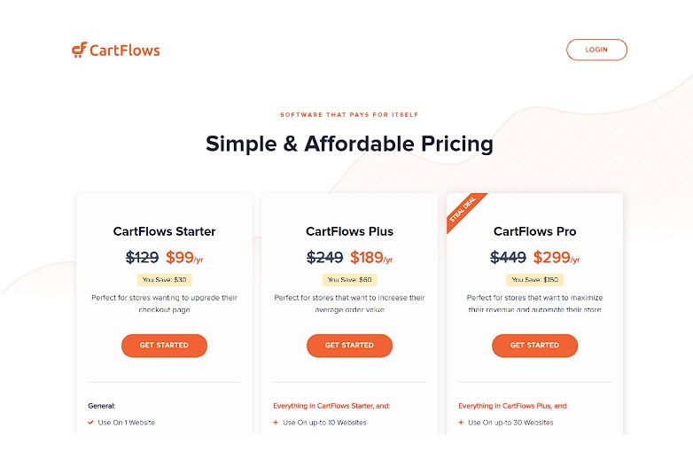
To get even better results with this strategy, use a countdown timer along with discounted prices. This persuades the customer to grab the offer before the timer runs out.
8. Additional Information Below the Fold
Keep product pages clean and organized by using the top half of the page for features and benefits and extra details below the fold.
You could use tabs to display additional information such as specifications, reviews, and FAQs to keep things tidy.
This allows customers to easily find the information they need without overwhelming them with too much detail.
For example, Natori, a luxury jewelry brand, offers its product-related information in collapsible tabs.
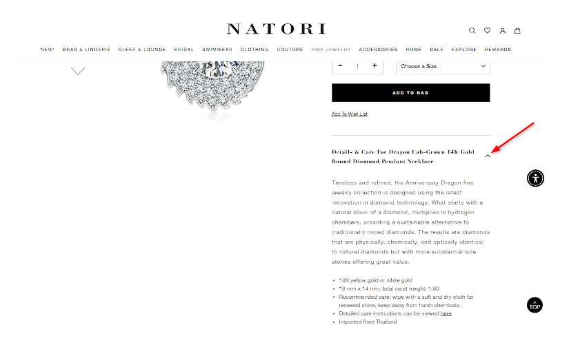
Keep the above the fold section simple - a product image, some conversion text, and an add to cart button.
Below the fold is where you add specifications, extra details, shipping, and other information.
9. Increase AOV With Related Products
Showing items that complement the current product can lead to additional sales.
That’s why we recommend suggesting related products to increase the average order value (AOV).
For example, you must have seen this on Amazon or Walmart, where the website recommends products based on items in your cart.
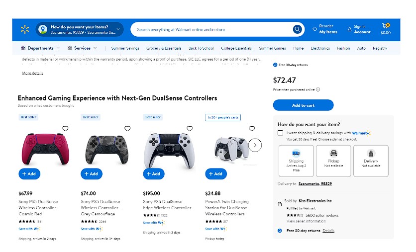
In some cases, instead of a related product, you can recommend a related service.
For example, extended warranty and insurance if someone buys a mobile phone or other high value item.
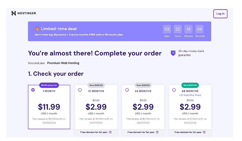
10. Boost Sales With Cross-Sells/Upsells/Downsells
Using cross-sells, upsells, and downsells can help increase revenue with relatively little effort.
According to Predictable Profits, 35% of Amazon’s revenue comes from upsells - offering a premium product priced higher than the item in the cart.
For example, Hostinger incentivizes visitors to go for a 48-month plan with maximum savings and 3 free months.
If you want to create an online store using WordPress, try a WordPress eCommerce plugin like SureCart.
It’s a complete online store platform that offers native upselling and cross-selling features as part of the package.
11. Optimize for Mobile Devices
Responsive design is at the core of everything, but it’s so important, it’s worth mentioning here.
Ensure your store is mobile-friendly as a significant portion of traffic comes from mobile, so when you choose a theme, prioritize mobile responsiveness from the start.
Use responsive design so your site looks great and functions well on all screen sizes. Buttons should be large enough to tap easily, and text should be readable without zooming.
The Souled Store, a fashion brand, offers both a website and a mobile app.
Notice the layout consistency, the minimalist product page, and the optimal button placement.
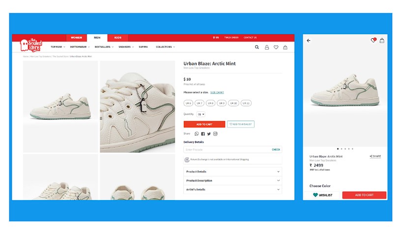
Since most online shoppers now use small screens, it makes sense to keep mobile in mind when starting an eCommerce store.
12. Display Featured Products/Bestsellers/Latest Arrivals
Highlighting featured collections, bestsellers, or new arrivals on your homepage and category pages can guide customers to popular or new products.
This can help visitors discover items they might not have searched for directly.
For example, Bite shows its best-selling products prominently on its homepage.
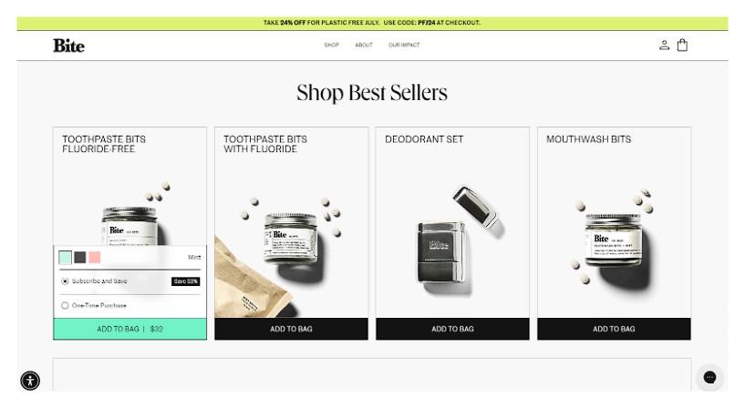
A “New Arrivals” section can attract frequent visitors looking for the latest trends or a “Best Sellers” section can highlight high margin items.
We recommend showing your latest products on the homepage since most of your new users will land there first.
13. Create a Seamless Checkout Process
According to Baynard, 22% of online shoppers abandon their carts because the checkout process is too complex or too long.
Simplify the checkout process as much as possible to reduce cart abandonment.
A one-page checkout streamlines the experience, making it faster and less frustrating.
Allbirds offers an excellent example of what a checkout page should look like. Keep the form fields to a minimum and offer a comprehensive cart summary along with multiple payment options. Choosing high-performance Magento Hosting is also key to ensuring consistently fast load times for eCommerce sites. Additionally, consider implementing a Hyvä theme on your eCommerce store on Magento. It’s visually appealing, lightweight, and significantly improves website speed and performance.
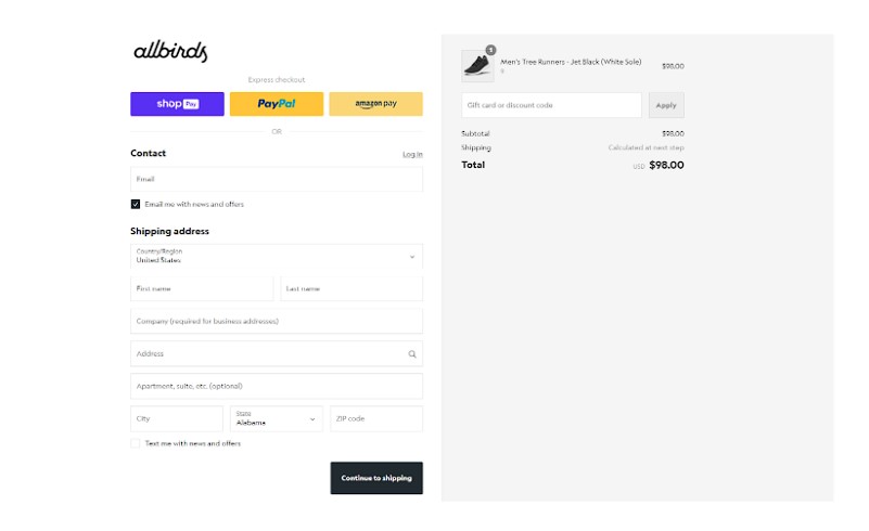
You can even add a one-click order bump to boost your AOV. The order bump can be the same for all the customers or based on the cart items.
14. Engage Window Shoppers With Video
Video can be a powerful tool to engage visitors and showcase products in action.
Use videos to demonstrate product features, share customer testimonials, or provide tutorials.
Linguise, an AI translation plugin for websites, captures its users’ attention with a prominent video on their homepage. In the video, the presenter tells the user what Linguise is, what it can do, and why you need it - all within 90 seconds.
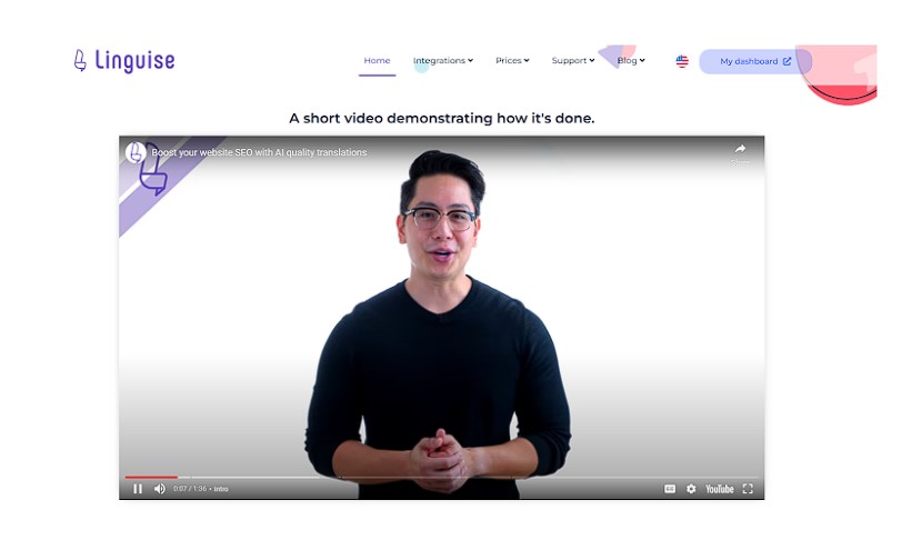
You could also show customer video reviews, not only to engage but also to establish trust and authenticity.
15. Gamify the Buying Process
Gamification uses game-like elements such as badges, levels or rewards that provide a dopamine hit to shoppers.
Offer rewards, points, or badges for certain actions like making a purchase, writing a review, or sharing on social media.
Here’s an example of an online store that shows how to gamify the shopping journey the right way. One reward is already unlocked, but to get 10% off (another reward), the customer has to buy more items worth €5.02.
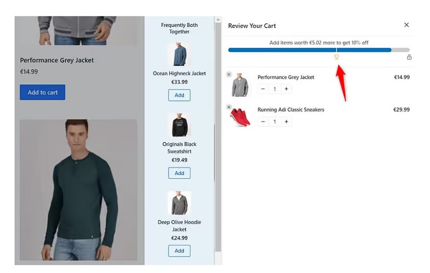
Gamification can lead some shoppers to buy more in order to unlock more rewards.
You can even offer reward points for specific actions. For example, with WooCommerce Points and Rewards, you can reward customers for sharing videos on Instagram or referring friends, and they can redeem those points for discounts on future purchases.
16. Make It Easy To Choose a Product Variant
If products come in different sizes, colors, or styles, make it easy for customers to select their preferred variant.
Use clear, clickable options and provide visuals for each.
For instance, showing color swatches and allowing customers to click through different options can simplify their decision-making process.
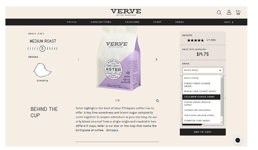
Here’s Verve, an online coffee bean retailer. They sell their coffee beans in various varieties, so they offer a simple dropdown for their customers to choose one.
17. Create a Prominent Search Bar and Keep It Visible
A search bar helps customers find what they’re looking for quickly. Place it prominently at the top of your site and ensure it returns accurate results.
For example, Welly, a first-aid kit seller targeted towards kids has a welcoming website with great images and colors.
There’s a search bar up top to ensure customers find the right product without having to navigate the entire website.
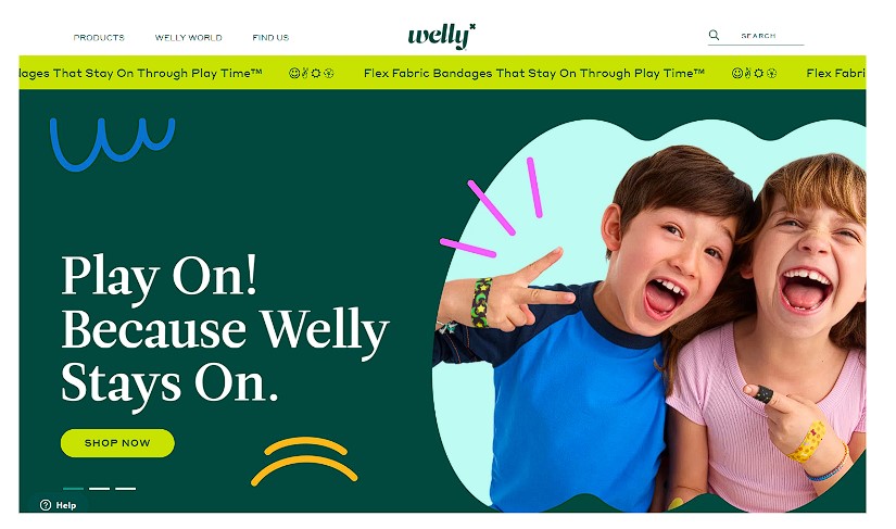
You can incorporate autocomplete suggestions to speed up the search process and guide users to relevant products.
Are You Ready to Design the Perfect eCommerce Store?
Implementing these UI/UX design tips can significantly enhance the user experience on an eCommerce website. A clean design layout contributes to greater customer satisfaction and improves the eCommerce conversion rate. A WordPress Ecommerce development service can also help you build a user-friendly and visually appealing online store that drives more conversions.
Suggesting related products or upsell offers can help you close sales with a higher AOV, which ultimately leads to increased revenue.
By focusing on usability, clarity, and engagement, you can create an online store that not only attracts visitors but also turns them into loyal customers. Don’t forget to market your online website too. Share them on Pinterest or Snapchat and maximize the effort you made.
So, which UI design tips do you like the most?
Do you have any UI design tips for ecommerce websites that we missed?
Let us know in the comments!
Written by DesignCrowd on Monday, August 12, 2024
DesignCrowd is an online marketplace providing logo, website, print and graphic design services by providing access to freelance graphic designers and design studios around the world.
