Where do you find great artists or designers? You’ll probably think of galleries, art studios, advertising agencies, or fashion houses.
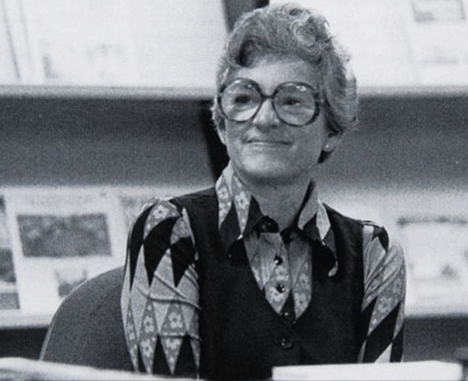
But Jacqueline Casey is different. This minimalist designer created breathtaking works that shaped the visual identity of the Massachusetts Institute of Technology (MIT), a university focused on science and technology.
With her unique approach to typography, Casey redefined how people see educational and scientific campus events and projects—proving that great design should not be limited to just the art industry.
Join us as we examine Jacqueline Casey’s life and famous works and consider how her design principles can be applied to modern-day branding and logo design.
Source
Who Was Jacqueline Casey?
Casey was born in 1927 in Quincy, Massachusetts, to a working-class couple who struggled to make ends meet. While she always wanted to be an artist, her parents insisted that she major in bookkeeping and administration services instead, as this would offer more work opportunities.
She eventually prevailed over her parents' wishes and studied at the Massachusetts School of Art, majoring in Fashion Design and Illustration. She had to work part-time as a bookkeeper and cashier at Art School Associates to fund her school expenses. This is when she befriended pioneer designer Muriel Cooper, who worked in the same place and went to the same school.
Despite her degree and talent, work in the fashion industry was lacking at the time. She had to make do with freelance fashion illustration projects and even some minor interior design work. However, she never found any work that she was truly satisfied with.
This all changed when she was hired at MIT’s Office of Publications in 1955, upon Muriel Cooper’s recommendation. MIT believed that words were not enough to convey their message properly and was looking for talented designers to handle their visual communications across the institute.
Casey took on the challenge, and her talent flourished in the scientific space. Both she and Cooper worked at MIT for many years, where they were given a free hand to develop a design style for MIT’s books, posters, events, publications, and more.
Her work and accolades eventually earned her the title of Director of the Office of Design Services in 1972. Casey’s designs not only promoted MIT events but also set new standards in visual communication.
Casey’s Signature Design Techniques
“I just think of the problem at hand, and I solve it in what I consider an appropriate way... I’ve always thought of design as being a creative act itself, creating something with a lot of emotion and excitement. I don’t see that you can pin it down with any equation.”
Casey’s works typically contain the following elements:
Strong typography
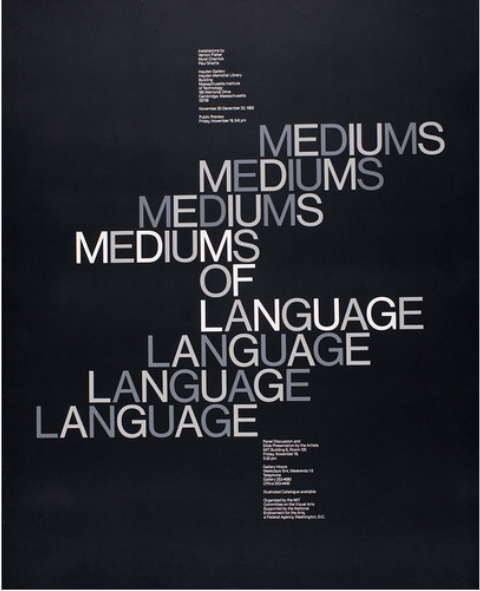
Mediums of Language
Casey was always drawn to expressive typography, but her works were taken to the next level when MIT invited designers from Europe for a visiting program. She was influenced by designer Thérèse Moll, who introduced her to Swiss and International Typographic styles.
You can see this influence with her usage of Swiss typefaces like Helvetica and Univers. But it wasn’t just limited to the typeface choice either. She used typography precisely to guide the viewer’s eye and help them read the information more effectively, which was a core belief in the Swiss style.
Minimalist approach
Another key part of the Swiss style is the minimalistic look. Casey believed in stripping away unnecessary elements to let the core message shine through. She also used white space effectively to create clean yet impactful posters.
Casey also preferred using clean geometric shapes and abstract imagery. This gave her works a more dynamic look while keeping it simple and tasteful.
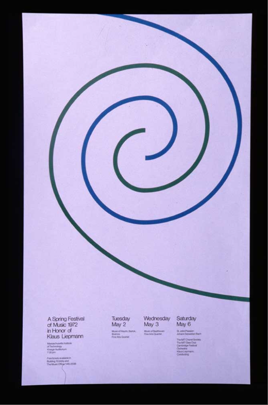
A Spring Festival of Music
Bold colors and contrast
Casey’s work was minimal in composition, but it was never boring. This is because of her fondness for striking colors and her use of high-contrast elements to draw attention. Her designs often featured vibrant reds and blues, which created eye-catching combinations that stood out among basic school posters.
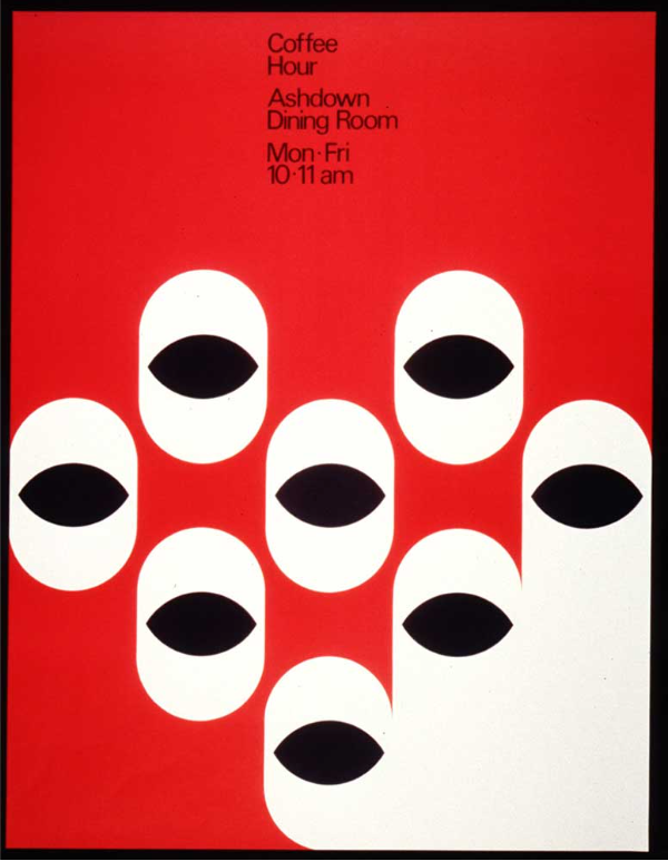 Coffee Hour
Modern Applications of Casey’s Design Principles
Jacqueline Casey’s work may have been around for over fifty years, but they remain a valuable and timeless source of inspiration for today’s designers.
Here’s how you can apply her principles in your own work:
Make use of typography
“My job is to stop anyone I can with an arresting or puzzling image, and entice the viewer to read the message in small type and above all to attend the exhibition.” (Casey, 1988)
Think of typography as a design element instead of just a simple text. Make it the focal point of your art. You can do this by using chunky fonts for a Y2K-inspired logo, a graffiti font for an urban vibe, or using bubbly fonts like Halo Dek and Arco.
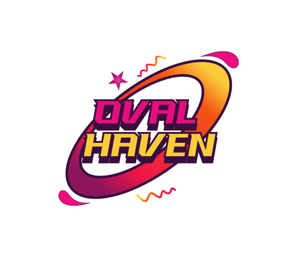 Galaxy Y2K Orbit by Design
You can also create your custom typeface by learning the type anatomy. A custom typeface gives you more creativity as you can control how the font will look instead of just using an existing font.
Typography is not limited to font style, either. Play around with the arrangement, kerning, or weight of the letters. You can also add distortion, waves, or iridescence.
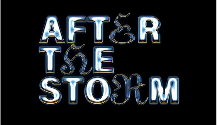 Iridescent Chrome Effect
Embrace minimalism
Casey proved that less is indeed more, as her posters relayed important information to the students and teachers without overwhelming or boring them.
Follow her lead by removing unnecessary elements from your designs. Focus on legibility and readability. This principle can even be applied to your UI and UX design or your web design.
You can also go for abstract logos, using a symbol that encapsulates all your messages instead of relying on multiple illustrations or fancy texts.
 Pyramid Abstract Triangle by Design
Use color with a purpose
Color can be used to evoke emotion. Think about the mood you want to convey and choose your color accordingly. Want your design to catch people’s eye? Use a bright red. Want a more serene vibe? Use sky blues or soft lilacs.
A good knowledge of the color wheel and color theory can also help. Casey likes to pair red and black for a more dynamic look, which is approved by color theory as they are great contrasting colors.
Casey also used color as her main design element. For example, in her poster, Goya, she used red splatter to symbolize bloodshed in the war.
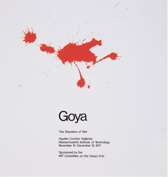 Goya
Goya
Conclusion
Jacqueline Casey's contributions to graphic design cannot be underestimated.
Her works are exhibited at MIT, the Chelsea School of Art, the London College of Printing, the Library of Congress, the Museum of Modern Art, and the Cooper-Hewitt Museum. She received the William J. Gunn Award (1988) and an honorary doctorate from Massachusetts College of Art (1990).
These are huge achievements for a designer, especially during her time when women were only starting to be accepted in the workforce. She also proved that campus posters can be taken to the next level, from simple announcements to beautiful works of art.
If Jacqueline Casey inspired you, why not try your hand at making a logo with our typography logo templates? You can also create your own Swiss-style design with our poster maker and flyer maker tool.
Which designer do you want us to feature next? Let us know!
Written by DesignCrowd on Thursday, February 13, 2025
DesignCrowd is an online marketplace providing logo, website, print and graphic design services by providing access to freelance graphic designers and design studios around the world.
