N logos command attention in ways few other letters can match. Its sharp angles and bold diagonal lines create instant visual impact across every medium. Whether scrolling through apps or driving past billboards, an “N” logo can stop you in your tracks.
Major brands gravitate toward N because it delivers strength and motion in a single character. The letter bridges stability with forward momentum, never feeling static or lifeless. Its natural connection to words like "new," "next," and "navigate" gives companies an immediate psychological edge with their audiences.
This article explores why N has become such a powerful foundation for brand identity. We'll uncover the visual and psychological forces that make this letter effective. You'll discover how leading brands have transformed N into their defining symbol, plus practical insights for anyone using a logo maker to craft their own N-based identity.
What Makes "N" an Excellent Choice for Brand Identity
The letter N carries natural advantages that designers have recognized for decades. Its geometric structure offers stability while its diagonal suggests forward motion. Few letters combine strength, movement, and versatility effectively in a single form.
Visual strength and dynamic movement
Strong vertical lines create stability and reliability in the letter N. These solid uprights act as pillars that ground the design and communicate dependability. They give N a structural foundation that few other letters possess.
The diagonal creates forward momentum and prevents the letter from feeling rigid. This balance makes N ideal for brands wanting to project trustworthiness and innovation. The angled line guides the eye naturally from left to right, creating a sense of progression that viewers absorb instantly.
Psychological associations and meaning
The letter N triggers immediate associations with navigation and direction. It suggests guidance and purpose to anyone who sees it. The bridging diagonal reinforces this sense of connection and movement between points.
This psychological resonance appeals especially to brands positioning themselves as industry leaders. The human brain processes these associations instantly, giving N-branded companies a significant advantage in recognition and recall. The letter communicates forward momentum without saying a word.
Design versatility and adaptability
N works beautifully across every design style imaginable. A thin-lined N conveys elegance while a thick, blocky version projects strength. The negative space within and around the letter offers endless creative possibilities.
The triangular voids on either side can house hidden symbols or add visual intrigue. N adapts seamlessly across cultures and industries without losing its core identity. It needs no translation, making it perfect for international brands.
Scalability and recognition
N maintains clarity at any size, from favicons and tiny app icons to massive billboards. This universal readability makes it incredibly practical for modern brands. The geometric precision built into the letter ensures reliable reproduction.
This consistency matters enormously in today's multi-platform world, where logos appear everywhere from business cards to stadium displays. Designers can trust N to look sharp and professional in any context.
Notable Brands That Lead With "N"
These companies have transformed the letter N into industry-defining symbols that transcend simple typography. Each brand has found unique ways to make this single letter represent its values, mission, and market position.
Netflix
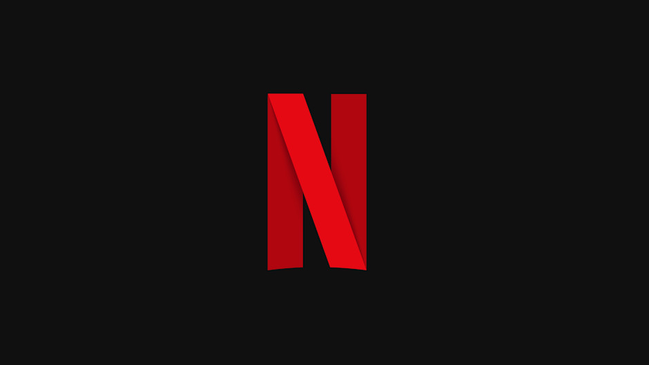
The bold red N stands alone as one of the most recognized symbols in entertainment. Netflix evolved from its full wordmark to relying solely on the single letter as its primary icon. This shift reflects the company's confidence and market dominance.
The ribbon-like treatment adds depth and dimensionality to the N. This layered approach hints at the vast content library available on the platform. Netflix proves that a brand can strip away everything except one letter and still achieve instant global recognition.
Nestlé
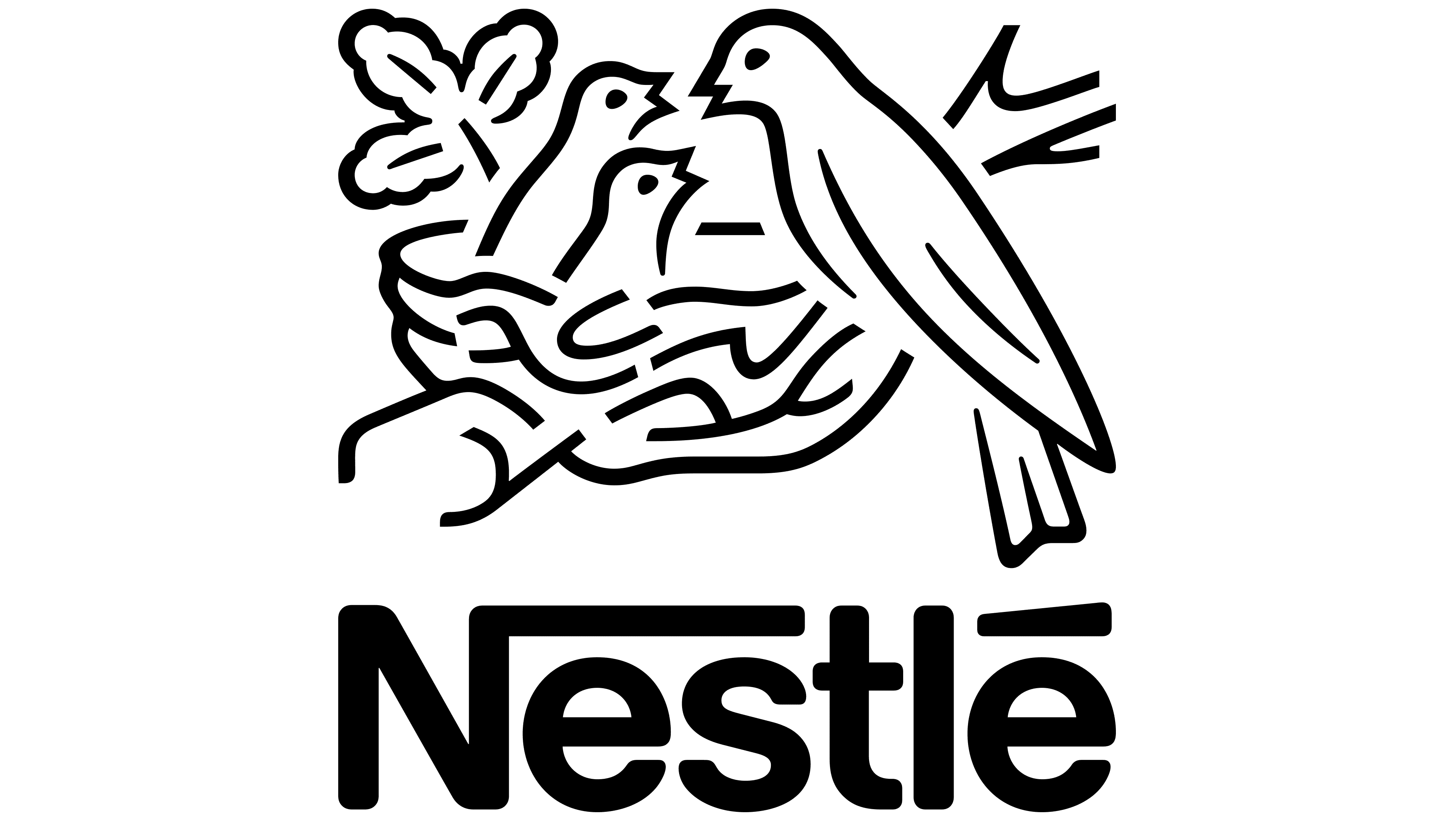
The nest concept is integrated directly into the N to create one of the cleverest logo designs in food. Small birds nestle above the company name, making the logo a visual metaphor for home and family. This literal interpretation has remained consistent for generations.
The warmth of the nest imagery balances perfectly with the structural strength of the N. The design shows how a letter can convey symbolic meaning and typographic clarity. Nestlé proves that literal doesn't mean simplistic when executed with care.
Nespresso
The Nespresso N features a distinctive curved flourish that wraps around the letter. This elegant swoosh adds sophistication and movement to an otherwise simple letterform. The flowing curve transforms a basic N into a symbol of premium coffee culture.
The decorative element whispers luxury rather than shouting it. This understated flourish elevates the N without overwhelming it. The letter becomes a mark of refined taste, perfectly aligning with the brand's position in the specialty coffee market.
Nintendo
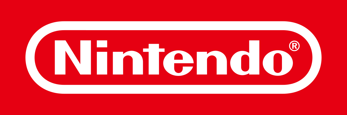
Nintendo's gaming logo has evolved from classic rounded forms to more angular treatments over the decades. Each iteration maintains the friendly accessibility that appeals to players of all ages. The letterforms balance playfulness with authority.
The current design feels both nostalgic and contemporary. This timeless quality comes from the careful evolution of its typography. The latest treatment captures childlike wonder while signaling technical sophistication, perfectly representing a brand that serves everyone from casual gamers to hardcore enthusiasts.
Newsweek
Clean, readable letterforms define the Newsweek N. The straightforward treatment suggests objectivity and professionalism without any decorative flourishes. The letter communicates editorial authority through simplicity alone.
This no-nonsense approach reinforces the publication's commitment to factual reporting. The N doesn't try to be flashy or trendy. It simply projects the seriousness and reliability readers expect from trusted news sources.
New Balance
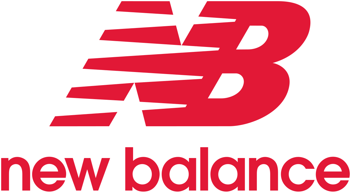
The N in New Balance's logo captures athletic energy through dynamic letterforms. The design reflects the brand name through careful weight distribution and visual symmetry. Movement and stability coexist in a single character.
The letter suggests motion without sacrificing balance. This duality reflects the brand's philosophy of striking a balance between performance and comfort. The N becomes a visual representation of the support and stability that athletes seek in their footwear.
Nasdaq
The Nasdaq N is defined by modern, clean lines. Its contemporary styling reflects the technological sophistication of electronic trading platforms. The letter bridges traditional financial authority with digital innovation.
The N speaks to both Wall Street veterans and tech-savvy traders. Its forward-thinking design positions Nasdaq as a leader in financial technology. The letter suggests the speed and precision of modern markets.
Nissan
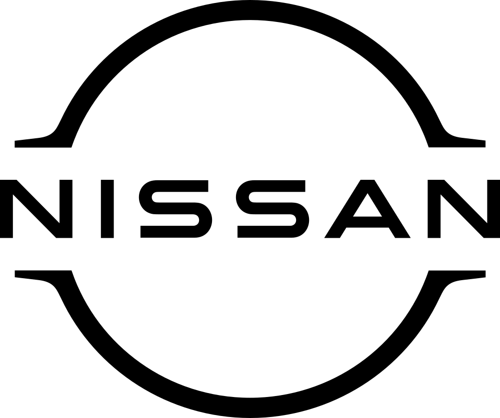
Nissan's logo sits within a circular badge, adding completeness and global reach. The industrial letterform communicates reliability and engineering excellence. The design bridges Eastern and Western aesthetic sensibilities.
The logo projects automotive confidence and manufacturing precision. The circular frame contains the wordmark while suggesting motion and continuity. This combination of strength and movement suits an automotive brand perfectly.
Nikon
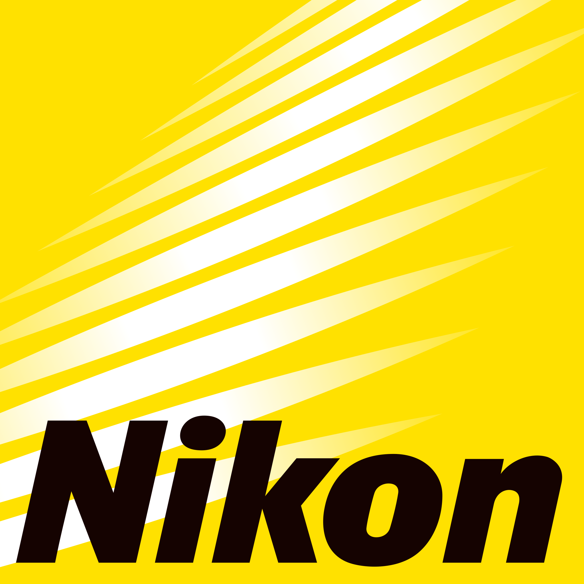
Nikon's logo embraces clean, modern simplicity. The letterform avoids unnecessary decoration, letting geometric precision speak for itself. This restraint mirrors the optical clarity the brand delivers through its cameras.
The logo's technical sophistication is evident in the careful proportions and spacing. It reinforces the brand's reputation for professional-grade imaging equipment. Every detail also reflects the precision photographers expect from Nikon products.
NASCAR
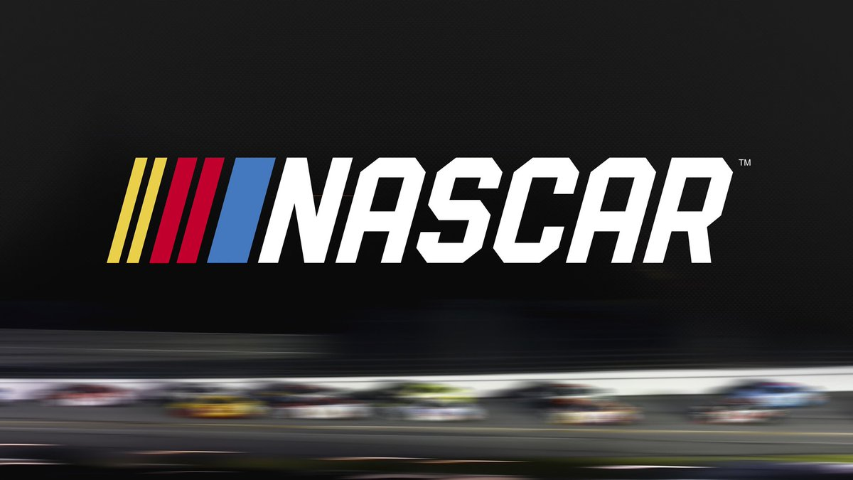
Aggressive angles and powerful lines define the NASCAR logo. The bold letterform captures the speed and intensity of stock car racing. The treatment mirrors the roar of engines and the thrill of competition.
The logo feels loud, proud, and unapologetic. It invites fans into the excitement while maintaining the edge that makes racing compelling. The design perfectly balances accessibility and intensity, which defines the motorsports culture.
N Logos Across Different Industries
The versatility of N becomes clear when you see how different sectors adapt it to their needs. Each industry brings unique requirements to logo design, yet N proves flexible enough to serve them all effectively.
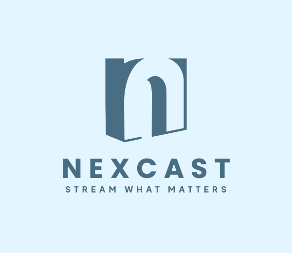
Tech brands
Technology companies favor clean, geometric treatments of N that suggest precision and progress. Sharp angles and minimalist approaches reflect the industry's cutting-edge nature. These digital-first brands use flat, scalable designs that reproduce flawlessly across screens of all sizes.
N naturally aligns with core tech values. The letter connects to concepts like navigation, networks, and new frontiers. Tech logos need to feel modern and forward-thinking, and N delivers this contemporary appeal while staying simple enough for seamless digital reproduction.
Get inspired by several samples of N logos in the technology sector below:
Digital Technology Letter N by Design.com
Digital Tech Letter N by BrandCrowd
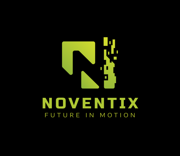
Pixel Tech Letter N by Design.com
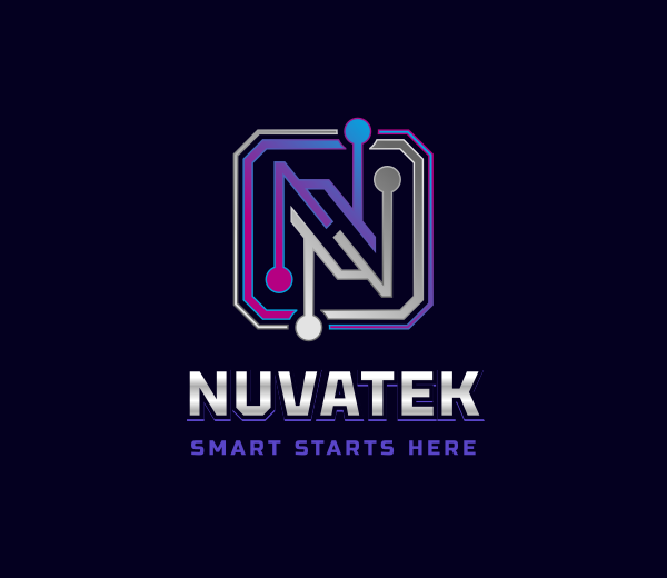
Digital Circuit Letter N by BrandCrowd
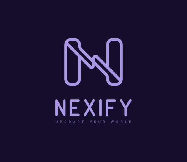
Cyber Brand Letter N by Design.com
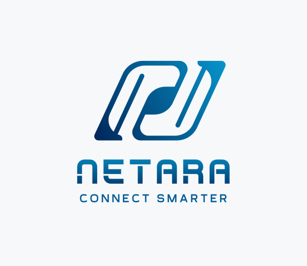
Creative Studio Letter N by BrandCrowd
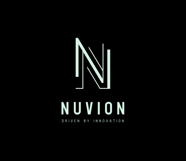
Tech Business Letter N by Design.com
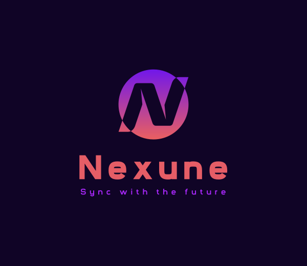
Cyber Tech Letter N by BrandCrowd
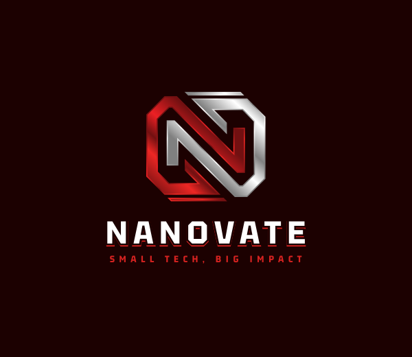
Technology Network Letter N by Design.com
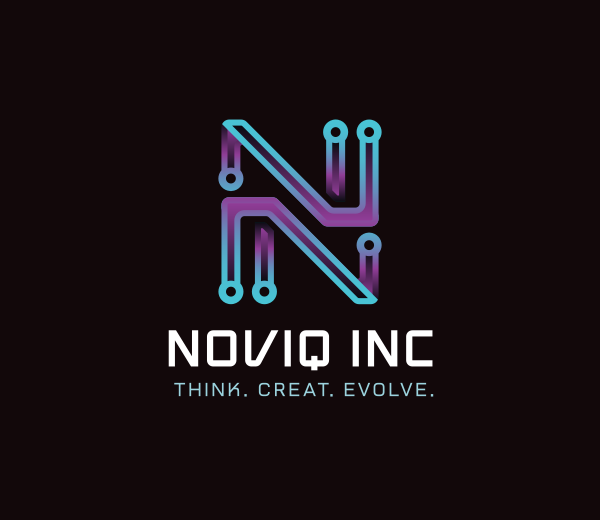
Technology Circuit Letter N by BrandCrowd
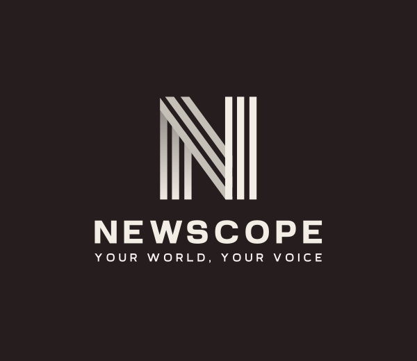
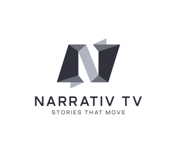
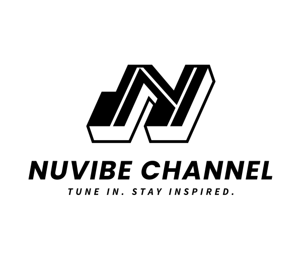
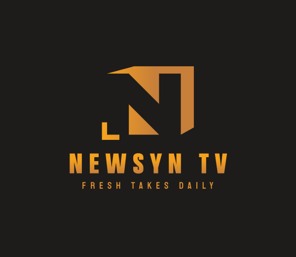
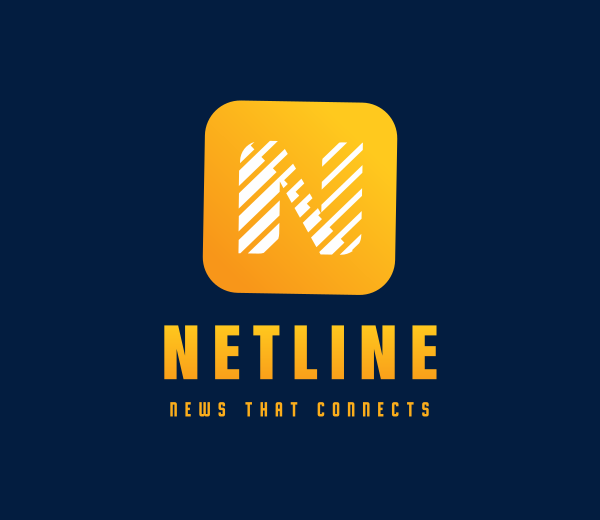
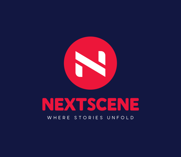
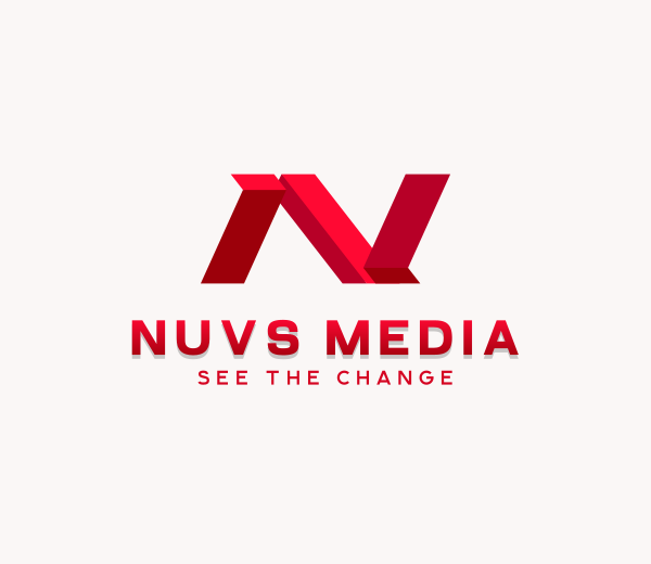
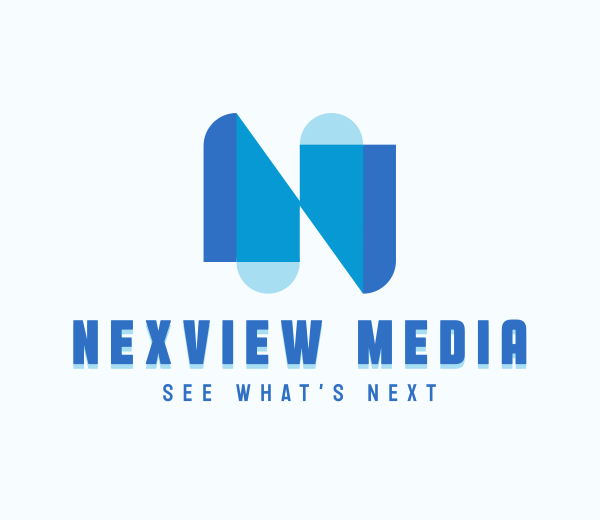
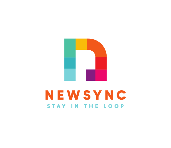
News & media companies
Editorial brands favor traditional, serif-heavy treatments of N that communicate authority and trustworthiness. Readability and timelessness matter more than trendy flourishes in this sector. News organizations need logos that project credibility because their reputations depend on reliability.
The structured nature of N naturally supports these goals. The strong vertical lines provide a visual foundation that builds trust with audiences. News brands can add subtle personality through font choice while maintaining the seriousness their readers expect.
Here are some examples of N logos in the news and media sector:
Stripes Generic Letter N by Design.com
Creative Media Letter N by BrandCrowd
Professional Business Letter N by Design.com
Professional Brand Letter N by BrandCrowd
Creative Studio Letter N by Design.com
Startup Modern Business Letter N by BrandCrowd
Professional Company Letter N by Design.com
Professional Brand Letter N II by BrandCrowd
Architecture Arc Letter N by Design.com
Multicolor Letter N by BrandCrowd
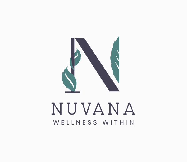
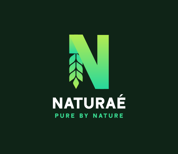
Health & wellness
Health-focused brands often soften the N with rounded edges and organic curves. These designs feel approachable and nurturing rather than harsh or clinical. Natural colors and flowing lines help N logos communicate care and holistic health.
The letter works exceptionally well in this space because it connects to the word "natural." Wellness brands want logos that feel like friendly invitations rather than corporate stamps. N's adaptable structure makes it easy to balance professionalism with warmth.
Check out some N logos in the health and wellness industry below:
Leaf Boutique Letter N by Design.com
Wheat Agriculture Letter N by BrandCrowd
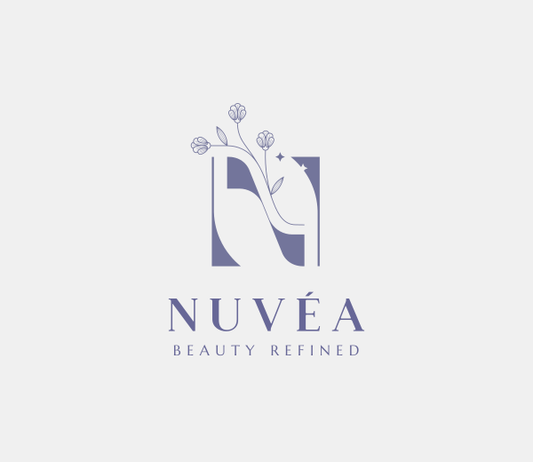
Beauty Salon Floral Letter N by Design.com
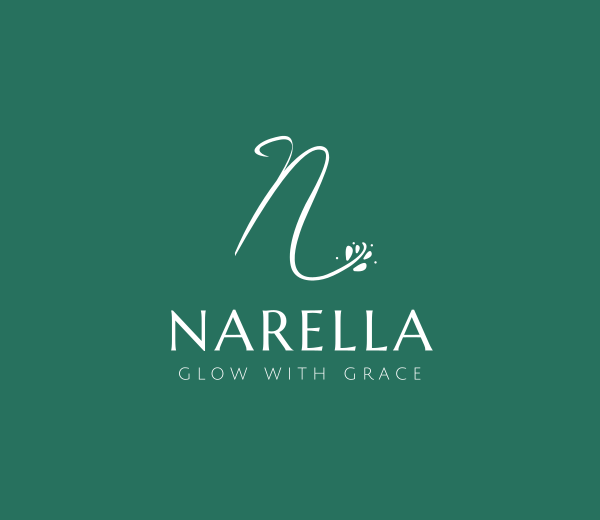
Floral Letter N by BrandCrowd
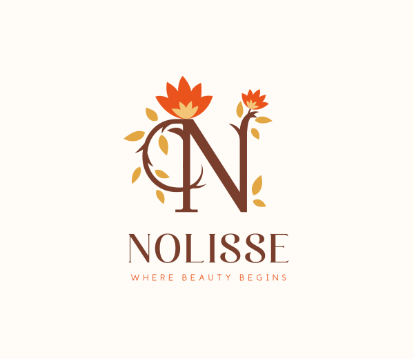
Flower Bloom Letter N by Design.com
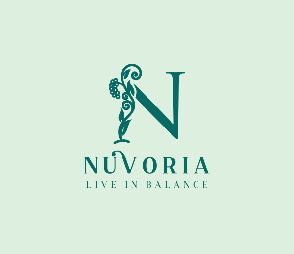
Natural Vine Letter N by BrandCrowd
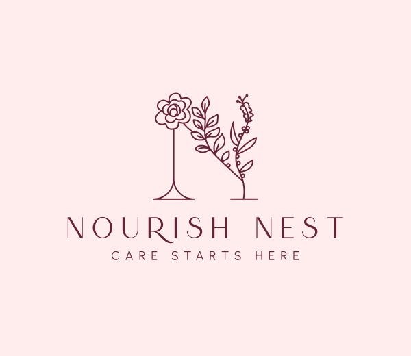
Flower Beauty Letter N by Design.com
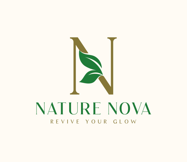
Nature Leaves Letter N by BrandCrowd
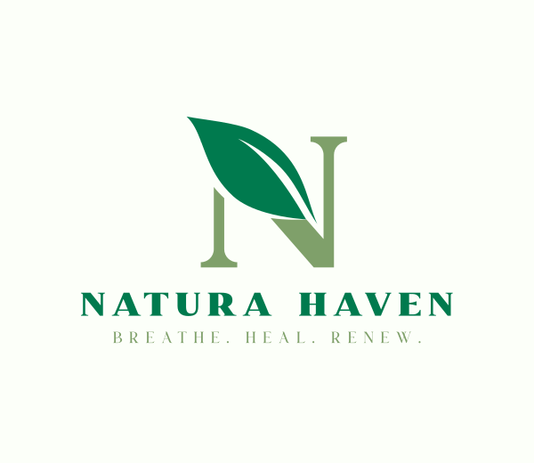
Eco Leaf Letter N by Design.com
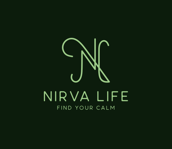
Elegant Script Letter N by BrandCrowd
Key Principles for Designing N Logos
Creating a memorable N logo requires understanding both the letter's inherent properties and how to adapt them to specific brand needs. These principles provide a foundation for designers approaching N-based brand identity projects.
Leverage the diagonal for directional energy
The diagonal line defines the letter N. When emphasized properly, this angled stroke suggests movement and progress. Designers use it to guide the viewer's eye naturally through the composition.
The diagonal can point toward other brand elements, create dynamic tension, or add visual interest to an otherwise static design. Consider whether you want your diagonal to feel gentle and flowing or sharp and aggressive. The angle and weight of this single line can transform the entire mood of your logo.
Create harmony between structure and fluidity
Balancing the rigid verticals with the flowing diagonal determines whether an N logo feels stiff or dynamic. The uprights provide stability while the diagonal adds life and movement. Weight distribution across the letterform matters enormously.
Too much emphasis on the verticals creates a heavy, grounded feeling. Too much focus on the diagonal can make the design feel unstable. The sweet spot lies in finding the right proportions for your brand, ensuring that structure and movement work together rather than fighting each other.
Maximize negative space potential
The triangular and rectangular spaces within N's form offer rich opportunities for creative exploration. These voids can house hidden meanings or layered design elements that reveal themselves on closer inspection. Some designers place subtle symbols in these spaces while others use them to create optical illusions.
Negative space can also provide breathing room, making the positive space more impactful. Don't overlook these areas when designing. The empty spaces around and within your N are as important as the letter in creating a memorable logo.
Align your N style with brand personality
Choosing between bold, elegant, modern, or classic treatments should flow directly from your brand identity. A luxury brand needs a very different N than a youth sports organization. Industry considerations and audience expectations guide these decisions.
Research what competitors are doing, but don't simply copy their approach. Your N should feel both appropriate for your sector and distinctive within it. The right style makes your brand instantly recognizable while communicating your unique value.
Prioritize versatility across applications
Testing your N logo across different sizes and contexts prevents problems down the road. A design that looks great on a computer screen might fall apart when embroidered on a polo shirt. Clarity from digital icons to physical signage requires careful attention to line weights and proportions.
Simplicity often wins because simple designs reproduce reliably across every medium. If your N logo relies on fine details or complex effects, create simplified versions for small-scale applications. A truly effective logo works everywhere it needs to appear, maintaining its impact from smartwatch screens to skyscrapers.
The Lasting Impact of N in Brand Design
The letter N delivers structural stability and dynamic movement in a single character. Its geometric strength communicates reliability while its diagonal suggests progress and innovation. From Netflix's bold red icon to Nespresso's elegant flourish, N adapts beautifully across every industry and brand personality.
Platforms like DesignCrowd and Design.com make creating your own N logo accessible and straightforward. DesignCrowd connects you with talented designers who can bring your vision to life, while Design.com offers AI-powered tools for DIY logo creation. Both approaches give you multiple design options, ensuring your N perfectly captures what makes your business unique.
Because when it comes to memorable branding, N is next-level.
Read more on logo designs here:
Hannah Suroy suroy brings clarity to complex topics across entertainment, business, and creative industries. She specializes in translating industry trends and innovations into engaging content that helps readers understand the creative process behind the work they love.
Header Image by Khim John Blazo
Written by DesignCrowd on Tuesday, October 21, 2025
DesignCrowd is an online marketplace providing logo, website, print and graphic design services by providing access to freelance graphic designers and design studios around the world.
