Streaming services battle for viewers with every second. With endless options available on every screen, what prompts someone to click on one app over another usually comes down to one simple principle – trust. And trust, in the OTT world, starts with branding.
The more an OTT business mimics what it looks, sounds, and feels like everywhere, the more folks start recognizing it and returning to it. Reputable branding isn’t just what makes a platform seem professional; it turns it into a brand people remember and come back to.
As the narrative flows through each channel, the stronger the connection between brand and audience. And in a market that is increasing at a rate that has never been higher, those little, consistent details are what separate brands that fade and those that stay with us.
That kind of instantaneous recognition isn’t something that just happens; it’s created by consistent visuals like your logo design, crystal clear messaging, and a unifying tone that all join forces to make your platform feel connected and authentic.
People who watch your content, visit your website, and scroll through your ad should all feel like they’re in the same world. That’s how genuine brand identity operates, not as adornment but as a shared emotional experience.
Visual Identity: The Color, Font, and Logos of Perception
The visual identity is the pulse of how audiences perceive you. Colors, fonts, and logos aren’t just a good-looking appearance — they can make people feel something.
Yes, colors do matter because they speak before the words.
- Warm and bright colors with orange or red convey energy, excitement, and action.
- Cooler tones, like blue or gray, are, in fact, calming and create a feeling of trust and professionalism.
That’s why brands choose the appropriate colors so deliberately, because each palette silently informs viewers what to expect.
Using the same palette in every ad, thumbnail, and interface builds a thread of recognition. People don’t have to consider; they just know that it is you. Fonts work the same way. A modern, bold font conveys to guests that you’re forward-thinking and forward-looking. A serif typeface can bring a sense of traditional reliability.
Even logos, their placement does matter, as does the volume of breathing space. Staying consistent helps the brand to appear balanced and confident. Eventually, those details cease to serve as “design choices” and become signals that announce, “You’re in the right place.”
Building a Brand Style Guide
It is as if a design guide is your map — it’s your guide for everyone in the company. It’s not just a set of rules; it’s the spine that maintains your brand’s recognition on any platform.
It’ll also incorporate color schemes, typefaces, logo use, image tone and style/language. But more importantly, it should explain why those choices matter — why friendliness comes through in your tone, why colors feel inviting, and why visuals follow a certain rhythm.
Keep it useful for readers. For instance:
- In a video, always put the logo in the top-right corner.
- Use HEX codes to keep digital color accurate.
- Keep the tone warm, conversational, and simple to understand.
When all designers, writers, and marketers use the same guide, the brand starts speaking simply and clearly. That unity creates familiarity, and familiarity breeds trust.
Building a Brand Voice and Messaging
You are your brand’s personality in your voice. It’s what makes a streaming app relatable.
In OTT platforms, where tone and storytelling matter most, your brand voice shapes emotion. If you’re targeting a younger user base, talk with energy and wit. If you are concentrating on professional or educational materials, feel assured and calm. Whatever your brand represents — entertainment, reliability, innovation — the voice should match it.
Consistency here is powerful. When your ads, push notifications, and app messages all “sound” alike, it seems viewers are starting to think they know you. They begin to trust you the same way they trust a known person.
Try this simple framework:
- Voice: Friendly, clear, and direct.
- Core message: Entertainment that feels personal.
- Do not: Be cold, robotic, and overly formal.
Your brand becomes instantly recognizable when every single message sounds aligned, even in a heavily populated feed.
Hulu: A Model for Modern Branding
Source
One of the greatest brands in the streaming industry for meaningful branding is Hulu.
Hulu's name comes from a Chinese proverb meaning “a bowl to hold precious things.” That fits right on budget because Hulu collects and shares stories, shows, and movies that people value deeply. The name lends the brand its meaning and poetic heart: it is simple but deeply meaningful.

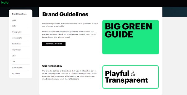
From the beginning, Hulu made many design choices that reflected its character. The bright green feels fresh and vibrant, alive, and is the kind of color that deliberately contrasts with the darker shades other streaming giants adopt. Clean typography and a minimalist interface only contribute to that feeling of being approachable and confident.
Importantly, Hulu’s voice never wanders. Regardless of whether it’s a TV ad, an app alert, a social post, or whatever, it feels like it comes from a human, modern place. That consistency across channels is what people trust.
The model that kept that name, despite the transformation of Hulu from an on-demand television into a live TV and original service, has remained the same since the day it launched. It grew visually and strategically, but the voice, colors, and general vibe stayed recognizable — and that’s part of what makes it powerful.
OTT Branding Success Across Platforms
Consistency pays off little if not concentrated only on your app. A truly successful OTT brand has its tone and visuals consistent across all channels, from social media to email marketing to the in-app experience.
Your digital presence is, in many ways, a single continuous narrative threading through several different episodes. While each channel provides context, the emotion remains the same. That’s what enables users to feel like, wherever they find you, they’re still inside your world.
Aligning social media and OTT branding
Social media is often the first place new viewers are introduced to your brand, if you are using this marketing channel. For this reason, the logo, tone, and color palette of your brand must feel instantly recognizable, with its very same emotion but tailor-made for each platform.
A quick teaser in your application’s style on TikTok, for example, should naturally be the perfect extension of the same brand that someone sees before it. That consistency allows for smooth transitions.
That’s where tools like Design.com, BrandCrowd, orbcome in, helping to maintain that harmony — because they let you create templates, control visuals, and apply your colors and fonts on every single channel. OTT platforms can also integrate affiliate software to monitor performance across marketing partnerships, ensuring that referral campaigns align with overall brand messaging and deliver measurable results.
It is when your social and OTT branding are in sync that the viewers should have confidence in the journey from one to the other when it all feels like you all at once.
Your website, email newsletters, and even support pages are as much a reflection of your brand as the content you put in your videos. What you do is that you use every headline, color, or tagline that highlights who you are, every way it is stated, your identity. Review your content frequently to look for mismatched images or expired messages. Consistency through all touchpoints makes your brand feel organized, modern, and professional — and your audience notices.
Leveraging Content Calendars and Asset Management
Organizing teams ensures an easier time maintaining brand consistency. A content calendar helps to align OTT and social efforts and ensures all promotions and releases are telling the same story.
This prevents last-minute confusion and keeps the messages of the posts aligned, as does scheduling posts in advance. Asset libraries, often powered by asset management software, store approved logos, videos, and visuals so no one goes off-brand. Many teams also keep their design guidelines in a single PDF to ensure consistency. Tools that let you convert JPGs to PDF, rotate PDFs, and organize content make it easy to compile and update everything in one clean, shareable document.
Though this structure may seem small, it’s what helps your audience keep your experience smooth and connected. When each piece of content feels cohesive, people unwittingly view your brand as reliable and stable — and that’s treasure
Takeaways for OTT Startups
For OTT startups, branding often takes a backseat to product development. But it shouldn't. Branding is what transforms a platform into a name that people remember and trust — turning viewers into loyal audiences.
Key elements of strong OTT branding:
- Choose a memorable name. Start with a short, conversational name for your OTT business that clearly speaks to your mission. Make sure it carries meaning — even if subtle — so it resonates emotionally with your audience.
- Select colors strategically. Colors shape how people experience your brand before they even read your content. Warm colors inspire excitement and energy, while cool tones convey calm and trust. These choices create the emotional backdrop for your entire platform.
- Define a consistent voice. Decide whether your brand sounds playful, thoughtful, or authoritative — then apply that tone everywhere. Your visuals may evolve, but your core identity should remain recognizable and true to what drew people to you initially.
- Balance global appeal with personal connection. The best OTT brands strike a balance between being international and intimate. They speak to diverse communities while maintaining one clear, unified heartbeat.
When viewers see your logo, hear your tone, or recognize your colors, they should feel that instant familiarity. That's when trust forms — and trust is what keeps them watching. Consistency doesn't just make your brand look polished; it makes every interaction feel intentional and part of their lives. In a world overflowing with content, that's what makes a brand truly unforgettable.
Conclusion
Consistent branding is the quiet force behind every successful OTT business. When every element — from color palette to brand voice — works together, the result feels natural and familiar, like a story that continues seamlessly across every screen. Viewers don’t just see your brand; they experience it.
In a crowded streaming world, that emotional familiarity becomes a competitive edge. It reassures audiences that they’re in good hands, no matter where they engage with you. Strong branding also guides your internal teams, keeping every message and design aligned with your vision.
The OTT platforms that last aren’t always the ones with the biggest budgets — they’re the ones that stay consistent, authentic, and memorable. When your brand feels the same everywhere, it doesn’t just stand out — it stays with people.
Written by DesignCrowd on Thursday, November 20, 2025
DesignCrowd is an online marketplace providing logo, website, print and graphic design services by providing access to freelance graphic designers and design studios around the world.
