Dark mode has become a standard feature in apps, websites, and operating systems. It gives users the choice to view interfaces in darker tones, which many find easier on the eyes. But for designers and brand teams, it introduces a new challenge: keeping visuals, colors, and brand identity consistent when the background turns dark.
A logo design that looks clean and vibrant in light mode can look dull or even disappear against a dark background. Buttons, icons, and shadows may lose depth or contrast. Typography might feel harsh or too dim.
Designing for dark mode is about making sure your brand still feels like your brand.
This guide will walk you through how to adapt your brand assets, color palettes, and UI layouts for dark mode with practical tips, examples, and a workflow you can follow.
Let’s get started!
Understanding Dark Mode Design: Why It Matters

Usage statistics and user preference trends
Dark mode is no longer a niche preference. Many users now switch to dark mode automatically in the evening or use it full-time. It’s common in mobile apps, operating systems, and even websites. Designers need to plan for both light and dark versions of their product, not as a nice-to-have, but as a basic user expectation.
Benefits and challenges of dark mode
Benefits:
- Helps reduce eye strain in dim environments
- Can save battery on OLED screens
- Feels modern and premium when designed well
- Creates focus and a strong visual hierarchy
Challenges:
- Getting the right contrast without harsh brightness
- Adjusting brand colors that may look different on dark backgrounds
- Maintaining readability and accessibility
- Handling technical aspects like CSS themes or color tokens
In short, dark mode design or a dark logo improves user comfort and gives brands a more flexible, polished look. However, it takes care and testing to do it well.
Adapting Brand Assets for Dark Mode
Here are some of the brand assets you can use for dark mode design:
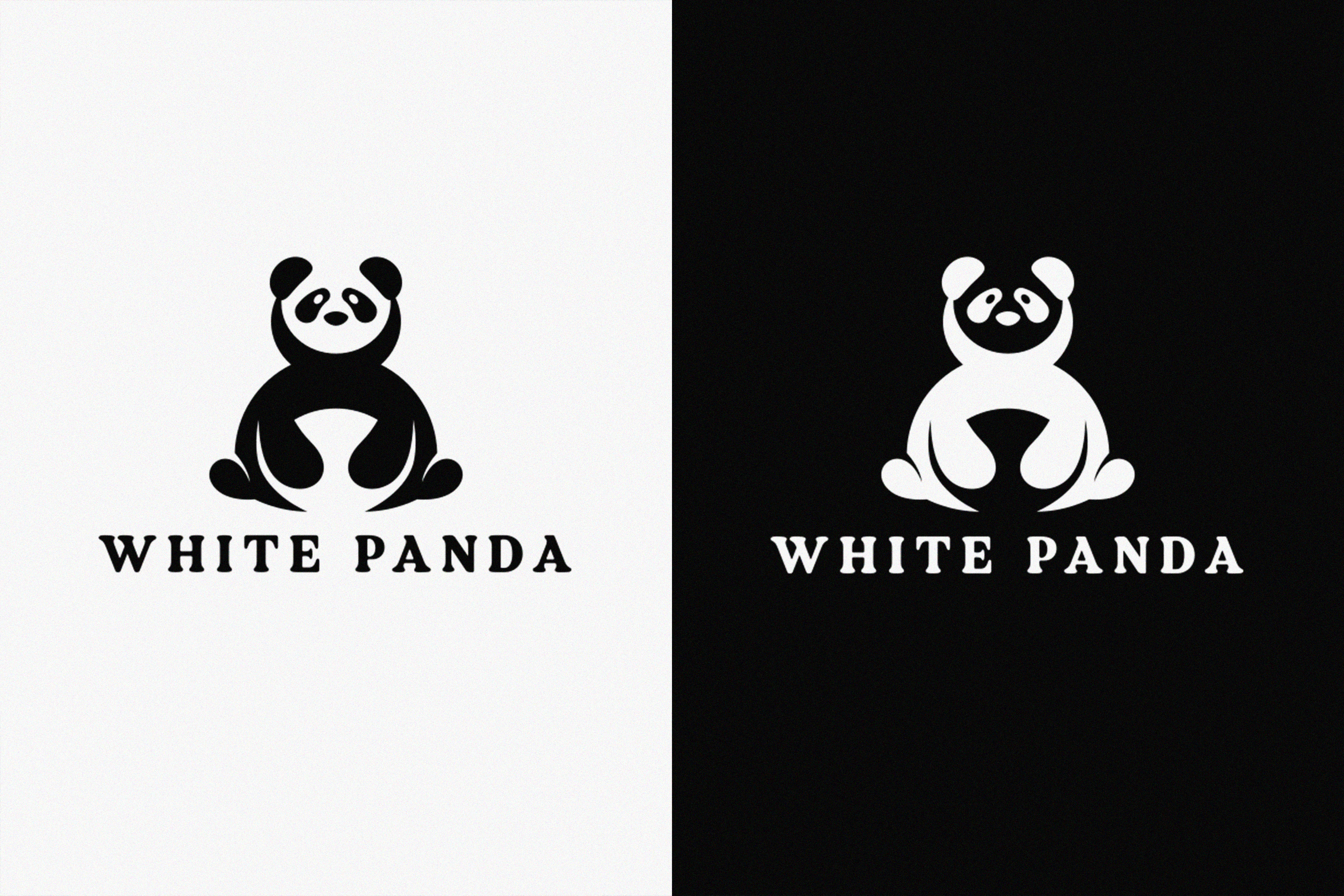
Logos and icons
Start with your logo. Most brands need at least two versions:
- A light version for dark backgrounds
- A dark version for light backgrounds
If your logo uses strong colors, create an outline or monochrome version that maintains legibility. Test how your brand icon appears at different sizes and contrasts. Avoid using pure white versions unless they fit your brand’s look; sometimes, softer tints appear cleaner.
When placing your logo, make sure it sits comfortably on both backgrounds. Sometimes adding a subtle outline, glow, or shape container helps it stand out.
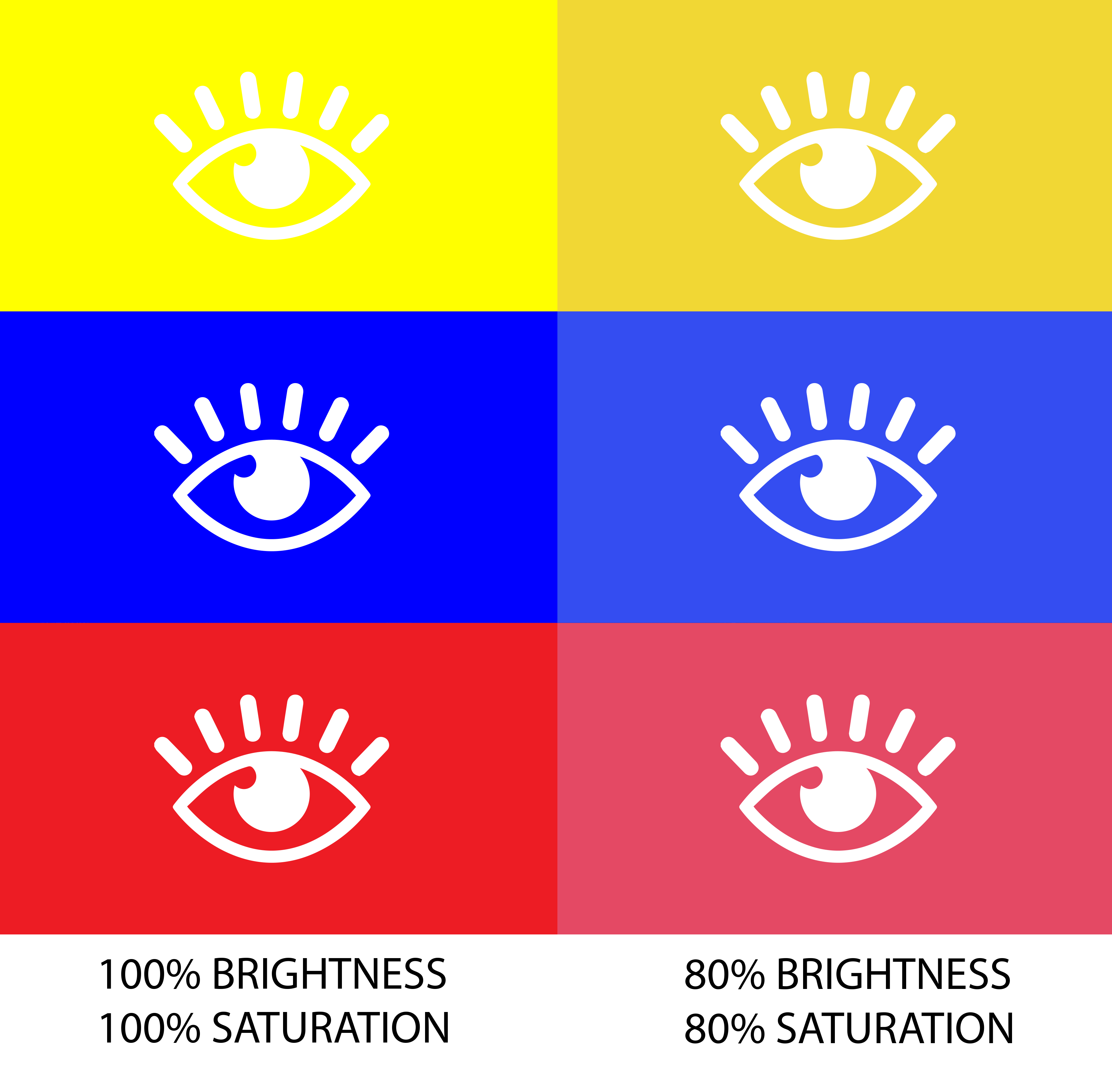
Color palette adjustments
Bright brand colors can look overly saturated or glowing on a dark background. Adjust hues to be slightly lighter or desaturated.
Avoid high-saturation neons unless you want a glowing, futuristic aesthetic. Aim for contrast that’s comfortable, not harsh. When in doubt, preview your design in both modes and test how it feels in real environments, and not just on your monitor.
Typography and text legibility
White text on black backgrounds can create a strong contrast that strains the eyes. Instead of using pure white (#FFFFFF), choose softer tones like #EDEDED or #EEE.
Keep a clear hierarchy between text levels (headers, body, captions) by using font weight, size, and opacity. Make sure small text still meets accessibility contrast standards.
Shadows, glows, and layering
In light mode, shadows help lift elements from the background. In dark mode, shadows are less visible. Use subtle glows or inner shadows instead to create separation and depth.
Soft blur and elevation changes can help you build layers without making the interface heavy or cluttered. Avoid strong outlines or hard edges unless they fit your design style.
Branding consistency
Your brand identity should stay the same across both modes. The mood, tone, and personality of your visuals should carry over, even if the colors and contrasts shift.
For example, if your brand feels warm and inviting, use muted tones and gentle highlights in dark mode too. The goal is to make users feel like they’re still in the same brand world, just with the lights turned down.
UI and Layout Design Principles for Dark Mode
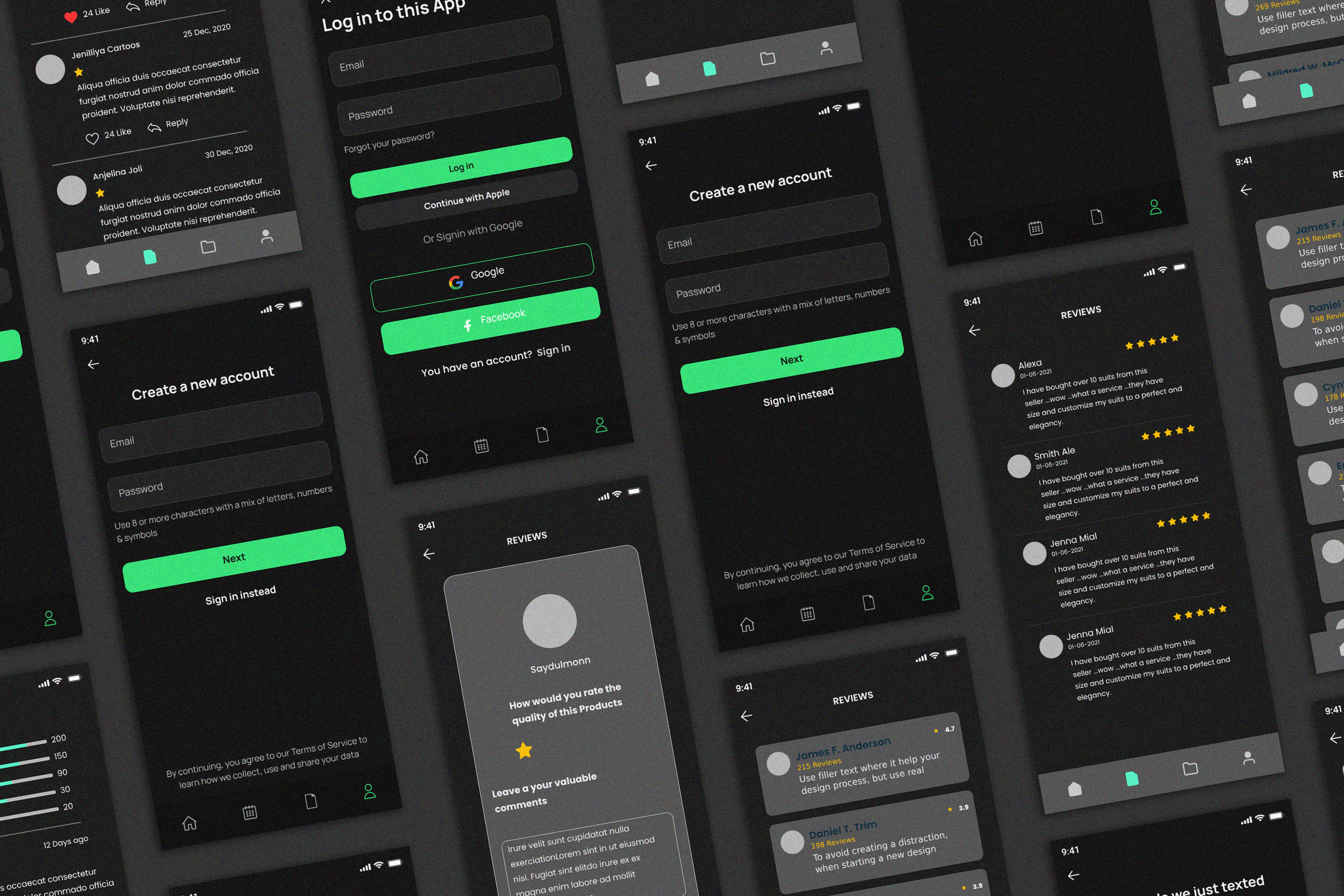
Contrast and hierarchy
Dark mode changes how users perceive contrast. Light elements stand out more, so use brightness intentionally. Keep primary buttons and active states bright enough to draw attention, but balance them with neutral surfaces for the rest of the UI.
Use of surfaces and layers
Dark interfaces often use multiple “surfaces” to separate sections or cards. These layers don’t need to be pure black. Use soft gradients or slightly different shades of dark gray to build hierarchy.
Adding subtle borders or soft shadows between layers helps guide the eye without clutter.
Feedback and interaction states
Make sure hover, active, and disabled states are still clear in dark mode. You might need to adjust the brightness, glow, or border to show feedback.
Test your buttons, toggles, and inputs in both modes to ensure users always know when something is clickable or selected.
Imagery, illustrations, and icons
Photos and illustrations often look different on dark backgrounds. Try adding a soft overlay or reducing contrast so images blend naturally.
For icons, create both light and dark versions. Use lighter fills or outlines for icons on dark surfaces.
Animation and transitions
Switching from light to dark mode should feel smooth. Avoid bright flashes or abrupt color changes. Use a short fade or soft transition between themes when using animation so users aren’t startled.
Defaults and toggles
Give users control. Add a theme toggle in your settings or navigation, and remember their preference. Respect system-level settings so your site or app automatically adapts when users switch modes.
Source
Best Practices and Accessibility Considerations
Good dark mode design should feel great to look at and easy for everyone to use. Here are a few things to check as you design.
- Keep strong contrast: Follow WCAG 2.1 guidelines and aim for AA or better. Make sure text and buttons stay readable in low light.
- Use more than just color: Combine color with icons or text labels so users who can’t see color differences can still understand what’s on screen.
- Check for color blindness: Test your design with simulators or plugins to make sure important elements don’t disappear or blend together.
- Don’t rely only on shadows: Shadows can fade in dark mode. Add brightness, outlines, or subtle borders to show depth and separation.
- Respect user settings: If someone has dark mode or reduced motion turned on, your design should follow those preferences automatically.
- Test on real screens: Try your design on different devices and in different lighting. OLED screens, in particular, can make dark colors look stronger or uneven.
Good accessibility makes your dark mode design not just stylish, but comfortable and usable for everyone.
Examples and Case Studies of Dark Mode Design
Many brands have already done dark mode well. Here are some examples:
Spotify
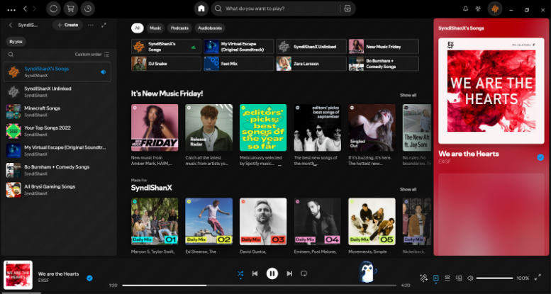
Spotify uses dark mode as its default, creating a cinematic experience that highlights album covers and colors without straining the eyes.
Twitter/X
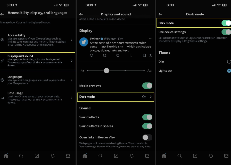
Twitter/X offers several dark themes (“Dim” and “Lights Out”), giving users a choice and maintaining readability with clear contrasts.
Dribbble
Dribbble and Figma both use dark mode options that highlight content while staying consistent with their brand feel.
These examples show that dark mode doesn’t need to change your brand’s voice. It’s about adjusting tone and light balance so your visuals stay clear and consistent.
Conclusion
Dark mode design is now part of modern branding. Whether you’re designing an app, website, or brand identity, planning for both themes ensures your product feels complete and professional.
Start with your logo, adjust your colors, test your typography, and build a clear style system. Always test for accessibility and user comfort.
Once you’re ready to create or test your dark mode logo and brand visuals, try using Design.com. Our AI design tools make it easy to preview how your logo and design assets look in dark environments, so you can keep your branding consistent everywhere.
Read more about UI and design here:
Frequently Asked Questions About Dark Mode Design
What is dark mode design?
Dark mode design is a user interface approach that uses dark backgrounds (typically black or dark gray) with light-colored text and elements, reversing the traditional light-on-dark color scheme. It's become a popular alternative display option in apps, websites, and operating systems to reduce eye strain and save battery life on OLED screens.
What are the downsides of using dark mode?
Dark mode can cause readability issues in bright environments where screen glare makes content harder to see, and some users experience visual problems like halation (light text appearing to bleed or glow). Additionally, it requires extra design and development effort to maintain two color schemes, and not all images, graphics, or content types work well on dark backgrounds without adjustment.
What is a key feature of the dark mode design trend?
A key feature is the use of elevated surfaces and subtle shadows to create depth and hierarchy, since traditional drop shadows don't work well on dark backgrounds. Dark mode designs rely on lighter shades of gray for layered elements and strategic use of color accents to guide attention and maintain visual interest.
Why does my logo look dull in dark mode?
Colors behave differently on dark backgrounds because they lose vibrancy and contrast—what looks bold on white can appear muted or muddy on black. Try using lighter tints of your brand colors, adding subtle outlines or glows for definition, or testing monochrome versions that rely on shape rather than color to maintain impact.
What's the best background color for dark mode?
Avoid pure black (#000000) because it creates harsh contrast that strains the eyes and makes colors look unnatural. Shades of dark gray like #121212 or #1A1A1A work better because they feel softer, reduce eye fatigue, and allow colors to appear more vibrant while maintaining the dark aesthetic.
How can I make text readable in dark mode?
Use off-white text colors like #E0E0E0 or #F5F5F5 instead of pure white to reduce eye strain and prevent harsh glare. Ensure your text-to-background contrast ratio meets WCAG accessibility standards (at least 4.5:1 for normal text, 3:1 for large text) to guarantee readability for all users.
Should I use gradients in dark mode?
Yes, but keep them subtle with darker tones and gentle transitions to avoid overwhelming the design or creating banding artifacts. Gradients can help create depth, add dimensionality to flat designs, and guide the eye through your interface when used thoughtfully in dark environments.
Can I test my logo for dark mode?
Yes, and you should test it thoroughly before finalizing your design. Tools like Design.com's logo maker, Figma, Adobe Illustrator, and browser developer tools let you preview your logo on dark backgrounds, test color variations, check brightness and contrast ratios, and ensure legibility across different screen types and lighting conditions.
Original Artwork by Selwyn Legaspi
Written by DesignCrowd on Thursday, November 27, 2025
DesignCrowd is an online marketplace providing logo, website, print and graphic design services by providing access to freelance graphic designers and design studios around the world.
