You've spent weeks perfecting it. Every spacing decision was deliberate, every color chosen with care, every component arranged exactly right. Then the developer builds it, you open the browser, and something just feels... off. The fonts are slightly different. A section doesn't quite line up. The hover effect you described isn't working the way you pictured it. Even modern no-code tools and AI-powered website builder platforms can run into these challenges when translating designs into live experiences.
Sound familiar?
The gap between a polished design mockup and a live, working website is one of the most frustrating parts of the creative process, and most design education simply doesn't prepare you for it. Design school teaches you how to use tools. It rarely teaches you what happens after you hit export.
This post is about that gap. Not to turn you into a developer, but to give you enough context to communicate better, collaborate more effectively, and stop feeling blindsided when the handoff goes sideways.
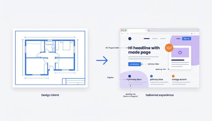
Your mockup is a blueprint, not a final product
This is the first mindset change that makes everything else easier.
Design mockups are static representations of an idea. It lives in a controlled environment where nothing moves, nothing loads, nothing fails. The real website is in the real world where users have different screen sizes, different browsers, different internet speeds and unpredictable behavior.
That doesn’t mean your design doesn’t matter. Strong visual elements such as typography, spacing, and even logo design still play a major role in shaping the final user experience. So 'pixel-perfect' is more of a goal than a guarantee. What you are really delivering to a developer is design intent, and the clearer you can communicate that intent, the better the end result.
One practical habit that helps enormously: design with real content wherever possible. When you use lorem ipsum text and placeholder images, you're designing for a version of the site that will never exist. Real headlines break differently. Real product descriptions vary in length. Real user names don't all fit neatly in the same box. Designing with real content forces you to solve those problems before they become the developer's problem during build.
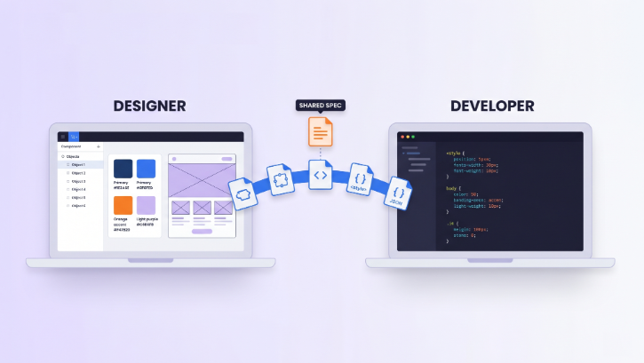
The handoff: where designs live or die
A design handoff is the moment your work passes from your hands to someone else's. How you do this matters more than most designers realize.
Tools like Figma's Dev Mode, Zeplin, and InVision have made handoffs dramatically better over the last few years. Developers can now inspect spacing values, copy CSS properties, and see exactly what font sizes and colors you used. But the tools only go so far. They can't communicate what you were thinking when you made a decision.
This is where annotations save lives. Make it a habit to write down the things you can’t tell just by looking at the mockup: what happens when a user hovers over that button, what the error state of a form field should look like, what a card component does when the title is 3x longer than expected. Developers are not mind readers and they often have time pressure. If something is not documented, it is skipped or can be interpreted as you did not intend.
Design tokens are another thing worth learning about if you haven't already. These are the named values behind your design decisions, things like "primary color" or "spacing-md" or "font-size-body". When a developer has a token system set up, changes are consistent and predictable. When they don't, updating one color might mean hunting through hundreds of lines of code. Advocating for a shared token system early in a project can save weeks of back-and-forth later.
And then there's the human side of handoffs. Building a good working relationship with the web developers you collaborate with is honestly more important than any tool or process. Ask them what information they find most useful. Ask them what typically gets lost in handoffs. Those conversations, early in a project, are worth more than any documentation template.
What actually happens during development
You don’t need to learn to code to understand this, but it will help to have a basic mental model.
When a developer builds your web design, they are writing HTML (the structure), CSS (the visual styling), and JavaScript (the interactive behavior). They’re looking at your mockup and they are making decisions all the time. Should this be a flexbox layout or a grid? CSS transition or a JS library for this animation? Is this component reusable or one off?
Some design decisions are easy to implement. Some are expensive in ways you can't tell from looking at a mock-up. A complex layered text effect that looks beautiful in Figma could take three times as long to build as a simpler version that looks almost identical in the browser. Knowing what kinds of things are typically technically hard to implement, i.e., custom animations, weird layouts, and non-standard interactive states, allows you to make smarter design decisions and have more productive conversations when timelines are tight.
It's also useful to know what you can do as a result of the content management system (CMS). If a site is built on WordPress, WooCommerce or similar then there are certain layout decisions that are limited by the way that platform works. Knowing this ahead of time changes how you design for content areas, particularly those that non-technical clients will be editing themselves post-launch.
Responsive design is another area where mockup and reality diverge most often. If you've only designed for desktop, you've designed for maybe half the actual user experience. Mobile-first design thinking, where you start with the smallest screen and scale up, doesn't just produce better mobile experiences. It often forces clearer design decisions overall.
The part most designers skip: hosting and deployment
Here's where most designers fully check out of the conversation, and it's a mistake.
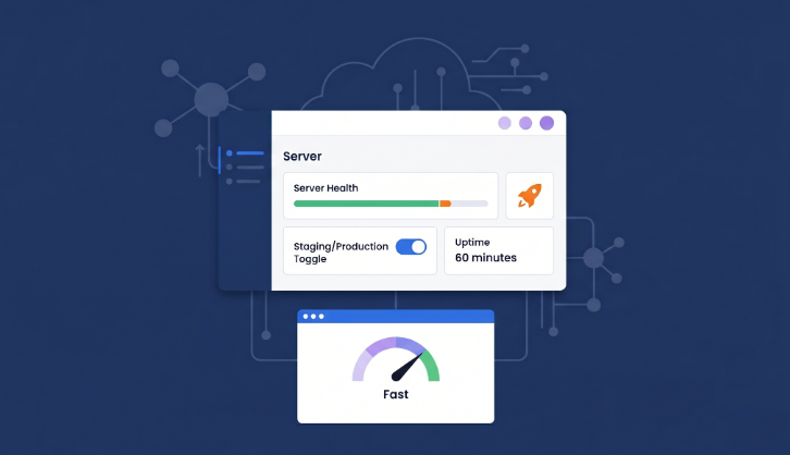
"Going live" sounds simple. It isn't, at least not behind the scenes. When a website launches, it needs to live somewhere: a server that stores the files, handles incoming requests, and sends pages to users' browsers. That server needs to be configured correctly, kept secure, updated regularly, and able to handle traffic spikes without falling over.
So why should this matter to you as a designer? Because choices about hosting have direct impact on the experience of your design. A beautifully made, well-crafted site that takes four seconds to load is worse for users than a simpler site that loads in one. Page speed affects bounce rates , conversion rates and even perception . The visual quality you slaved over is judged in the first fraction of a second, before the user has even seen it properly.
That’s why we’re seeing more of agencies and freelancers migrate to the managed cloud hosting platforms like Cloudways. This layer is handled automatically in managed hosting, so there’s no need to spend hours configuring servers, managing updates, and troubleshooting infrastructure issues. The developer (and thus, you) can concentrate on building and launching instead of babysitting servers.
If you work with or within an agency, it's worth knowing that platforms like Cloudways for agencies are specifically designed for teams juggling multiple client projects. Features like staging environments, where you can test changes before pushing them live, become especially useful during the design review phase when you want to see exactly how something looks and behaves in a real browser on a real server, not just in a prototype tool.
You don't need to become the hosting expert on your team. But understanding why it matters, and being able to have an informed conversation about it, makes you a much more valuable collaborator.
Things that will go wrong (and how to not be blindsided)
Even on well-run projects, the gap between mockup and live site produces surprises. Here are the most common ones.
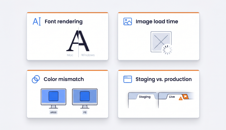
Fonts will render differently on different operating systems and browsers. The font appearance on your Mac in Figma will not be the same as it will appear on a Windows machine in Chrome. Weights can look a bit heavier or lighter, and some slight changes in anti-aliasing can change the overall impression of a headline. It’s not anyone’s fault, it’s just how the web works. The only way to catch it is to test on multiple devices and browsers.
Color profiles can also shift. RGB colors look different on different screens. So if you have been working on a well-calibrated screen, the site might look slightly different to most of your users . It's not so much a mistake as a reminder that you're designing for a variety of viewing conditions, not a controlled environment.
Images are a frequent culprit for sites that look great in the mockup but feel slow or off in the browser. Large, uncompressed image files take time to load, and the wrong format can cause quality issues. Working with your developer to establish an image optimization workflow, whether that's compressing files before upload, using a WebP converter to switch to modern formats, or implementing a content delivery network (CDN), pays off immediately.
And then there's the staging versus production gap. Staging is the test environment where changes are made and reviewed before they go live. Production is the actual live site. It's not uncommon for things to look good in staging and then break in production due to caching, different configurations or content that was not accounted for. That’s why QA testing is important, and why you should be involved in it as a designer and not just as someone who approved a screenshot.
What you can do right now to make launches smoother
None of this requires becoming a full-stack developer. It requires curiosity and a willingness to stretch slightly outside the traditional design role.
Build with components from day one. If you're designing in Figma, use components and auto layout. Not just because it speeds up your workflow, but because it maps more closely to how developers think about UI. A design built from reusable, consistent components is faster and easier to build, and changes cascade predictably.
Push for a design system before the project starts. Even a basic one. Agreed-upon type scales, color tokens, and spacing values prevent dozens of small inconsistencies that accumulate into a site that "almost" matches the design.
Get involved in QA. Open the actual browser. Click through the site yourself. Check it on your phone. You will see things no one else will see because you know exactly what it was meant to look like.
Questions about hosting and deploying. Not to make those decisions, but to understand the tradeoffs and constraints. A 10-minute conversation at the beginning of a project can save a lot of frustration at the end of a project.
And communicate constantly. The number of problems that come from assumptions is staggering. And I mean staggering. A quick check-in early in the build phase, when the developer has begun translating your designs into code, is worth far more than a long back-and-forth at final review.
Design doesn't end at export
The best designers I've seen are the ones who stay curious about what happens after they hand something off. Not because they want to do everyone's job, but because they care about the actual outcome, the thing a real user eventually opens in a browser.
Knowing how to get from design mockup to live website won’t make you a developer. But it will make you a better designer, a better collaborator and honestly, a more confident professional. You’ll have better conversations, cleaner handoffs, and you’ll stop feeling like launch day happens to you, rather than you’re a part of it.
If you are working with developers or clients who need a solid home for their projects, then recommending them a managed cloud hosting platform such as Cloudways is a really helpful suggestion. Less time fighting with the infrastructure, more time building the thing you actually designed, the way you actually designed it.
And if you ever need extra creative or technical support along the way, platforms like DesignCrowd make it easy to tap into a global network of talented designers, developers and creatives who can help bring projects to life faster and more effectively.
And that's what it's really all about.
Written by DesignCrowd on Thursday, May 21, 2026
DesignCrowd is an online marketplace providing logo, website, print and graphic design services by providing access to freelance graphic designers and design studios around the world.
